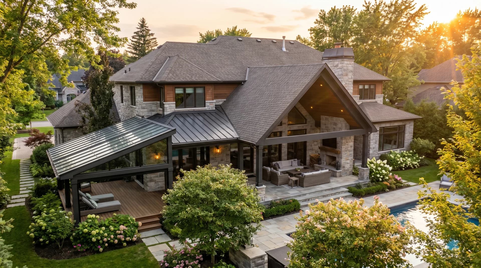
Ever walk into a room and just feel… right? That’s harmony at work. It’s the invisible thread that connects your furniture, colors, and textures into one cohesive space.
Harmony isn’t about matching everything perfectly. It’s about making smart choices that feel connected. When your design has harmony, your home feels calm, intentional, and easy to live in.
In this guide, I’ll show you what harmony really means, why it matters, and how to use color, texture, and style to create rooms that flow beautifully. Ready to make your space feel pulled together?
Let’s get started.
What Is Harmony in Interior Design?
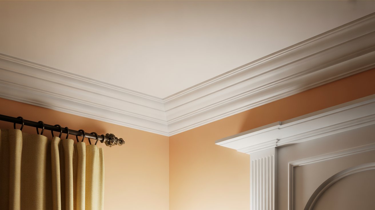
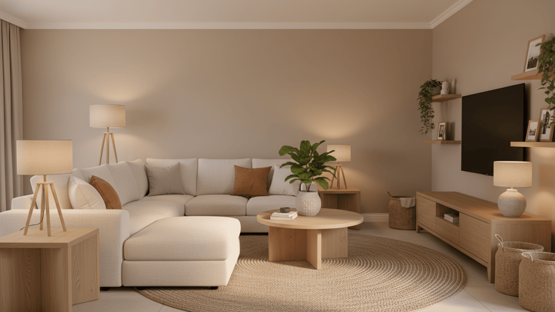
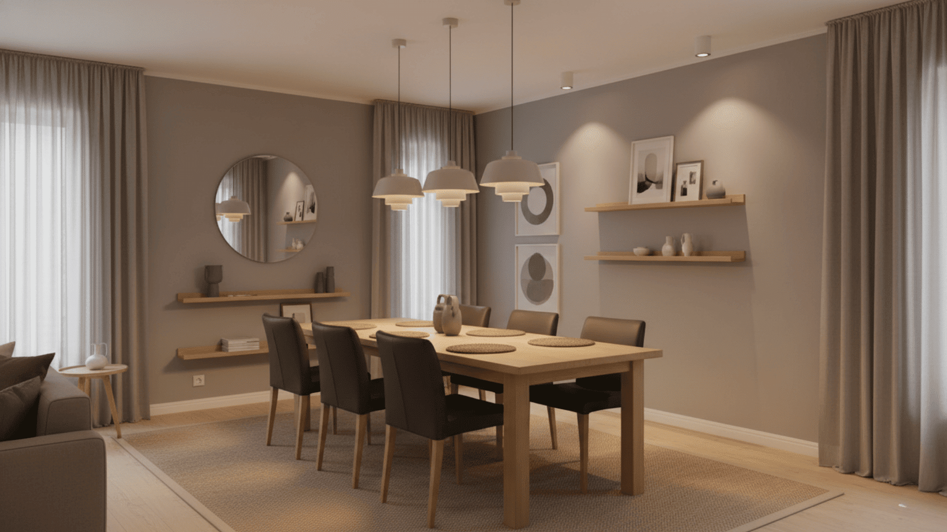
Harmony in interior design is the sense of unity you feel when all elements in a room work together as one. It happens when colors, textures, furniture, lighting, and décor feel connected.
Nothing looks out of place. Each piece belongs. Harmony does not mean everything has to match perfectly. It means your design choices support each other.
The result is a space that feels calm, complete, and comfortable to live in.
Harmony vs. Balance vs. Unity
| Design | What It Means | How It Shows Up |
|---|---|---|
| Harmony | A visually cohesive environment | Consistent palette, repeated materials, smooth transitions |
| Balance | Distribution of visual weight | Symmetry, asymmetry, radial layouts |
| Unity | A sense of completeness | Repetition of shapes, colors, or styles |
While these principles work together, harmony is what ties your design choices into a complete, comfortable space.
Benefits of Harmony
A harmonious room benefits more than just aesthetics. It affects your emotions, energy levels, and day-to-day experience.
- Creates a calming atmosphere: Spaces feel peaceful because nothing feels out of place.
- Improves functionality: Flow and purpose are clearer, especially in high-traffic rooms.
- Enhances visual appeal: Your eye can move smoothly across the space without distractions.
- Supports open-concept homes: Harmony helps different zones feel connected and intentional.
- Makes décor decisions easier: With a cohesive direction, shopping and styling become simpler.
Core Elements That Shape Harmony
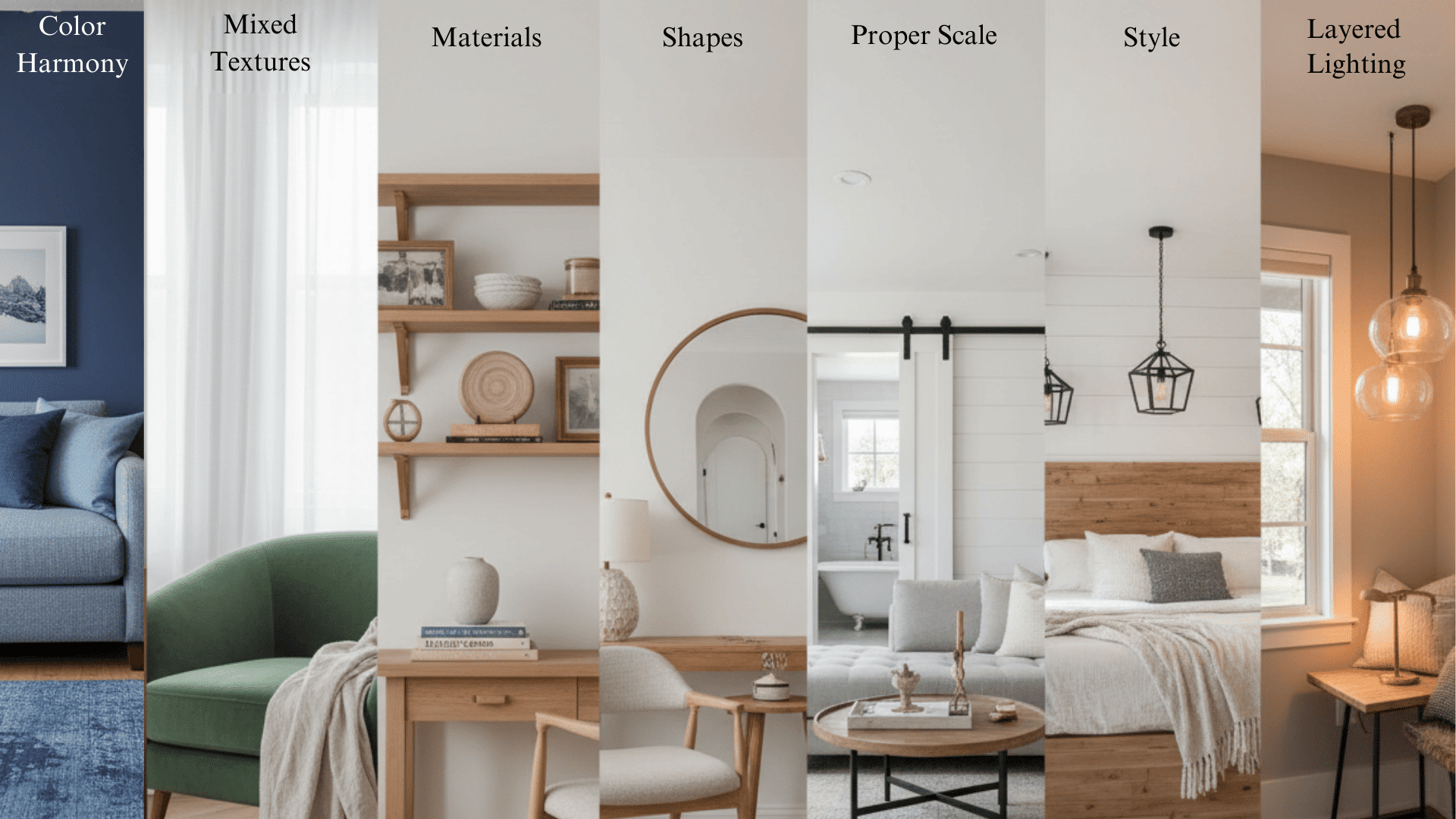
Harmony relies on aligning several design components. When these elements work together, the entire room feels balanced and cohesive.
1. Colour
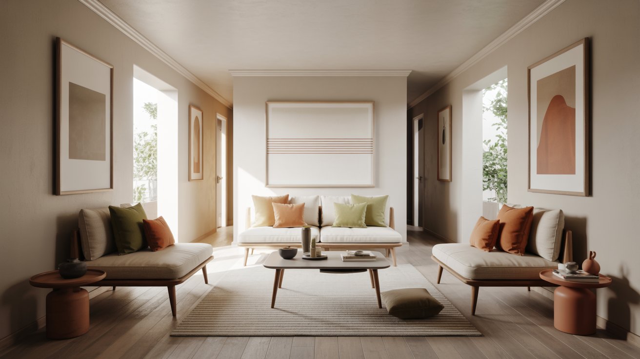
Color is one of the strongest contributors to harmony. A unified palette builds flow, even when mixing styles or patterns. Repeating the same tones across walls, furniture, and décor creates a visual connection.
2. Texture
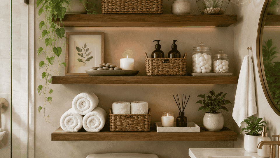
Using a mix of soft, rough, matte, and glossy textures adds interest without chaos. Consistent repetition of textures helps maintain harmony. For example, pair linen cushions with a jute rug and matte ceramic vases for balance.
3. Materials
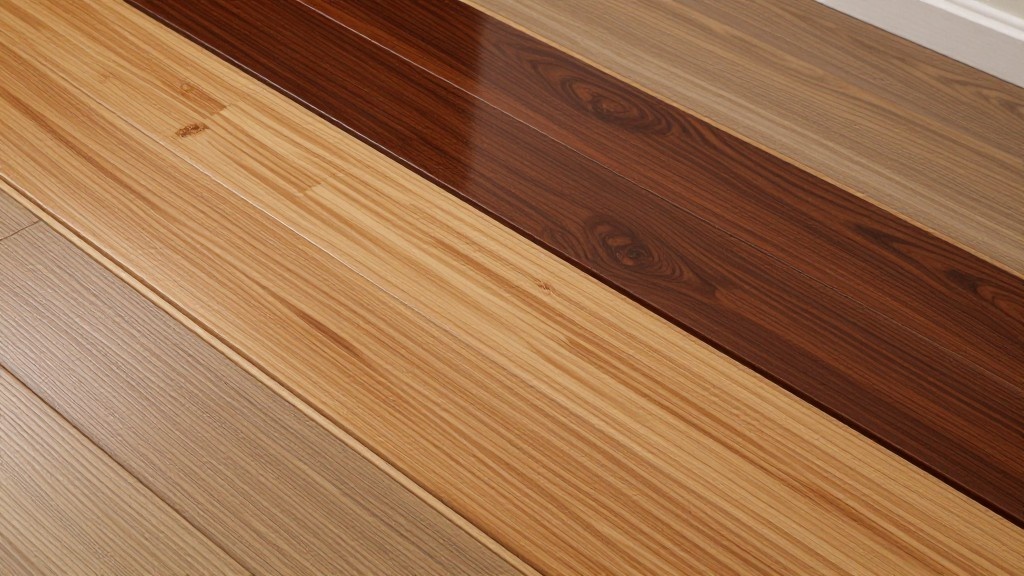
Repeating materials such as wood, stone, metal, or woven fibers keep the design grounded. When the same materials appear in multiple places, the room feels intentional. This works especially well in open spaces where different zones need to connect.
4. Shape and Form
Curves, angles, and lines should complement each other. Repeating shapes across lighting, furniture, or décor strengthens unity. If your sofa has rounded arms, echo that curve in mirrors, side tables, or light fixtures.
5. Scale and Proportion
When furniture fits the space comfortably, harmony naturally follows. Oversized or undersized pieces disrupt flow. Choose items that suit the room size and leave enough breathing room around each piece.
6. Style and Theme
Choosing a dominant style, even when blending, keeps everything grounded. Think modern farmhouse, coastal Scandinavian, or traditional with contemporary accents. A clear direction makes every choice easier and more cohesive.
7. Lighting
Lighting unifies a space through temperature, brightness, and placement. Coordinated lighting avoids harsh transitions between areas. Stick to warm or cool tones consistently, and layer ambient, task, and accent lighting for depth.
How Colour Harmonies Are Used in Interior Design
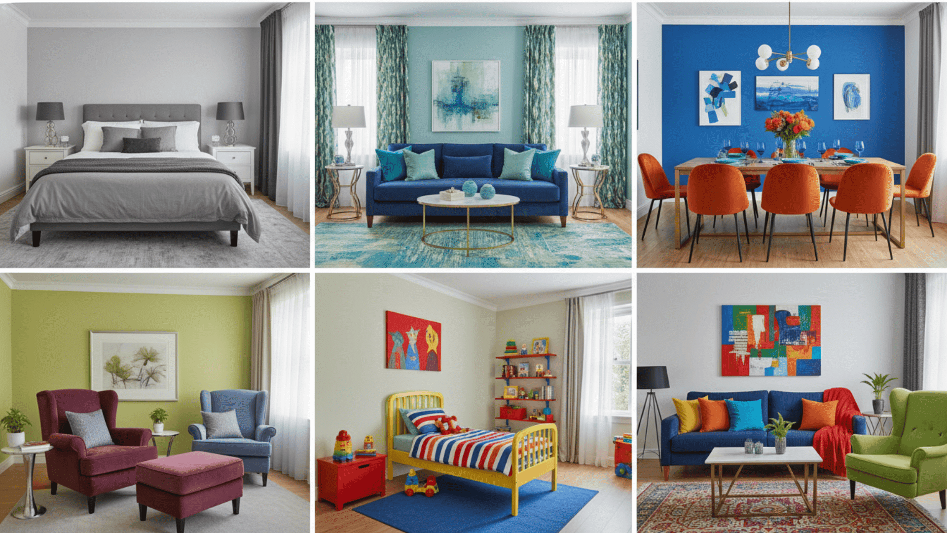
Colour harmony is a huge part of creating cohesive interiors. It helps connect walls, furniture, textiles, and décor in a way that feels intentional.
Colour harmonies are combinations of hues based on the color wheel. They help guide pleasing color relationships. Using these harmonies makes your design feel thoughtful and complete.
Common Colour Harmonies Used in Homes
| Type | Description | Best For |
|---|---|---|
| Monochromatic | One hue with varying tints and shades | Minimalist, spa-like rooms |
| Analogous | Colors next to each other on the wheel | Soft, cohesive design |
| Complementary | Colors opposite each other | High contrast, vibrant spaces |
| Split-Complementary | Base color + two neighboring opposites | Balanced and dynamic |
| Triadic | Three equally spaced colors | Playful or modern interiors |
| Tetradic | Two complementary pairs | Bold, eclectic designs |
How to Apply Colour Harmonies at Home
Here’s how to use color harmonies without overwhelming the room:
- Start with a dominant base color: Choose one main color that will cover most of your walls, large furniture, or flooring.
- Use 20–30% of a secondary color: This color supports your base and appears in rugs, curtains, or upholstery.
- Add an accent color sparingly for interest: Use pops of color in pillows, art, or small décor pieces to add life.
- Tie rooms together with recurring tones: Repeat the same colors from room to room for flow and connection.
- Use neutrals to create breathing room: Whites, grays, or beiges give your eyes a place to rest between colors.
- Match undertones between fabrics, paint, and flooring: Warm undertones should stay warm, and cool undertones should stay cool throughout.
Colour harmony works especially well for open-concept layouts because it creates smooth transitions between zones.
How to Create Harmony in Any Room
Now that you understand what harmony is and how color plays a role, let’s get practical. Here are seven simple ways to create harmony in any room, starting today.
1. Start With a Defined Colour Palette
Choose one main color and build supporting tones around it to guide your decisions. This palette becomes your foundation for paint, furniture, and accessories. Stick to it when shopping or styling to keep everything connected.
2. Repeat Materials and Textures
Use wood tones, metal finishes, or fabric types more than once to strengthen cohesion. If you have oak furniture in the living room, carry that wood into shelving or frames. Repetition creates rhythm and makes the space feel intentional.
3. Maintain Style or Blend Purposefully
If mixing styles, give yourself one unifying anchor, like color or shape, to keep harmony intact. For example, blend modern and vintage pieces while keeping them in the same color family. This prevents the room from feeling scattered or confused.
4. Use Repetition and Rhythm
Repeating shapes, colors, or patterns creates visual flow and strengthens unity. Echo curves, angles, or motifs across furniture, lighting, and décor. Your eye naturally follows these repeated elements, making the room easier to read.
5. Balance Variety With Consistency
A little contrast is great, but keep something consistent, such as pattern type or wood tone. Too much variety creates chaos, while too little feels flat. Find the middle ground by anchoring variety with one steady element.
6. Incorporate Negative Space
Not every surface needs décor. Space to breathe supports harmony. Leave gaps on shelves, empty wall sections, and clear surfaces. This gives your design room to shine without feeling cluttered.
7. Layer Lighting Thoughtfully
Use a mix of ambient, task, and accent lighting, preferably at the same temperature. Warm white or cool white should stay consistent across all fixtures. Layering light at different levels adds depth while keeping the mood unified.
Harmony in Popular Interior Design Styles
Harmony looks different depending on your style preferences. Here’s how popular design styles use harmony to create cohesive, beautiful spaces.
- Modern Minimalist: Neutral colors, clean lines, and intentional simplicity create calm, clutter-free spaces.
- Scandinavian: Soft palettes, natural textures, and plenty of light bring warmth and balance.
- Traditional: Balanced layouts, symmetrical arrangements, and repeating motifs offer timeless harmony.
- Bohemian: Eclectic elements tied together with unified colors or materials create free-spirited cohesion.
- Transitional: A blend of classic and modern that feels cohesive and balanced between both worlds.
Common Mistakes That Disrupt Harmony
Even with the best intentions, small missteps can throw off your entire design. Here are the most common mistakes that break harmony and how to avoid them.
| Mistake | Why It Disrupts Harmony |
|---|---|
| Too many unrelated colors | Creates visual chaos and prevents the eye from finding a focal point. |
| Mixing multiple styles without a shared anchor | Makes the room feel scattered and confusing instead of intentional. |
| Oversized or undersized furniture | Throws off scale and proportion, disrupting balance and flow. |
| Cluttered surfaces | Overwhelms the space and hides your design choices under a mess. |
| Inconsistent lighting temperatures | Mixing warm and cool tones creates harsh, jarring transitions. |
| Too many patterns competing for attention | Causes visual noise and makes it hard to focus on any one element. |
How to Maintain Harmony When Updating Your Space?
Maintaining harmony when updating your space starts with keeping your original color palette intact and refreshing accessories first.
When replacing large furniture pieces, match the existing scale, materials, or shapes so the new item feels like it belongs.
Strategic use of accent pieces, like a new rug, throw pillow, or lamp, can refresh the look without disrupting the overall feel, as long as you keep the undertones consistent.
To create continuity between rooms, repeat colors or materials from one space to the next. This approach ensures your updates feel intentional and connected rather than random or jarring.
Wrapping It Up
Harmony in interior design isn’t about perfection. It’s about connection. When your colors, materials, textures, and shapes support each other, your space naturally feels calm and cohesive.
You don’t need to follow every rule or spend a fortune. Start with a clear color palette, repeat materials thoughtfully, and give your rooms space to breathe.
Small, intentional choices add up to big results. If you’re decorating a single room or your entire home, focusing on harmony helps you create spaces that are inviting, beautiful, and effortless to live in.
What’s the first change you’ll make? Share your thoughts in the comments below!