Bathroom paint is one of the most overlooked decisions in a remodel. Tiles get all the attention. But color is the first thing you feel when you walk in. You notice it before the fixtures or the floor. Get it wrong, and even a well-designed bathroom feels off.
This article covers what works, why it works, and how to match color to your specific space.
Classic Neutral Paint Colors for Bathrooms
Neutrals work in almost every bathroom. They hold up when trends shift, pair with existing tile and fixtures, and give the room a clean, finished look.
1. White
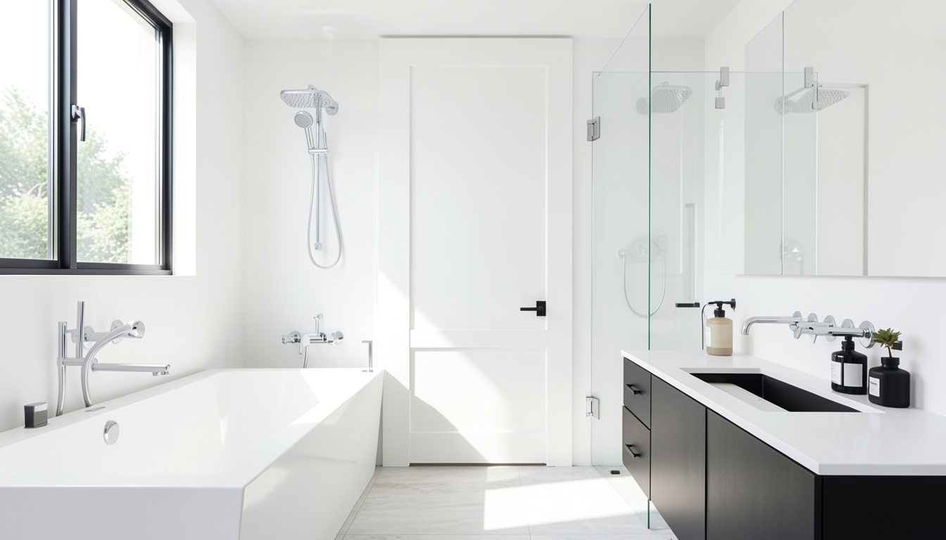
White is the top bathroom color choice for most homeowners. It reads as clean and open, even in bathrooms with no windows. But not every white performs the same on a wall.
The type of white you choose makes a real difference.
| White Type | What It Does | Best For |
|---|---|---|
| Crisp White | Sharp, clean, bright | Modern bathrooms with chrome or matte black fixtures |
| Warm White | Softens the room, adds comfort | Bathrooms with brass fixtures and warm grout |
| Off-White | Holds tone under changing light | Rooms with natural light that shifts through the day |
Pro Tip: Test your white in the actual bathroom before you buy a full can. A bright white at the store can go cool and grey under bathroom lighting. Use a satin or semi-gloss finish. Both handle moisture and clean up easily.
2. Warm Neutral Shades
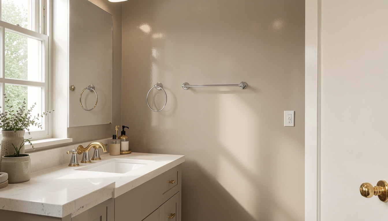
If your bathroom feels cold or too clinical, a warm neutral fixes that fast. Creamy beiges, soft greiges, and warm taupes bring comfort that white alone cannot.
| Neutral Type | What It Does | Best For |
|---|---|---|
| Soft Greige | Grey-beige mix, works with warm and cool tones | Bathrooms with chrome or gold fixtures |
| Creamy Beige | Adds warmth without darkening the space | Rooms with natural wood elements or warm floor tiles |
| Sandy Neutral | Calm and grounded | Larger bathrooms where a cooler shade feels too empty |
Warm neutrals reflect light softly. The result is a gentle, diffused glow. That’s the kind you find in a well-designed hotel bathroom.
Pro Tip: Warm neutrals can look muddy in low-light bathrooms. Go one shade lighter than you think you need. Add warmth through towels and accessories instead.
Calming and Soothing Colors for The Bathroom
Two color families do the most to make a bathroom feel restful: soft blues and muted greens. Both work well with most tile and fixture combinations.
3. Soft Blue and Pastel Shades
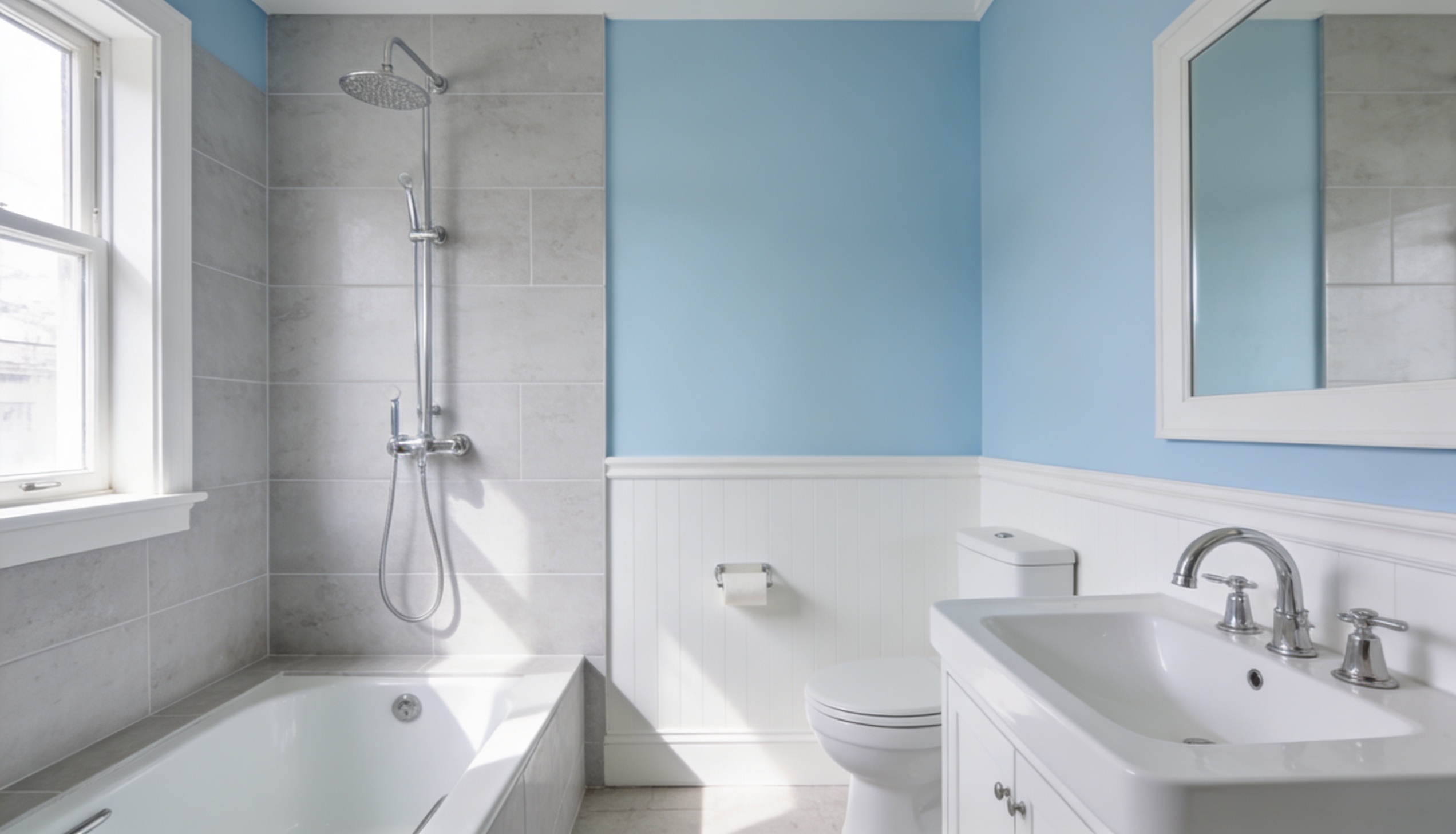
Blue is one of the most calming colors you can put on a wall. In a bathroom, soft blue creates a sense of quiet. It pushes the walls back visually. Even a compact space feels less closed in.
Soft blues that work best:
| Blue Paint Type | What It Does | Best For |
|---|---|---|
| Pale Sky Blue | Provides a light, airy quality to walls. | Perfect for small bathrooms that need to feel more open. |
| Powder Blue | Slightly richer but still calming. | Pairs well with white trim, chrome fixtures, and light grey tiles. |
| Icy Blues | Clean with grey undertones, not too cold. | Best for bathrooms with plenty of natural light. |
A 2021 Zillow study found that homes with light blue bathrooms sold for more than $5,000 above their expected price. That makes pale blue one of the few bathroom colors with documented resale impact.
Pro Tip: Pair a soft blue wall with bright white trim and ceiling. The contrast sharpens the room and keeps the blue from looking flat.
4. Serene Green
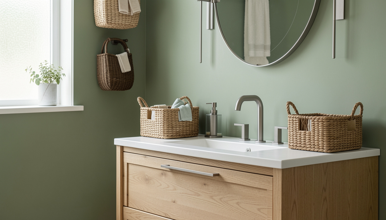
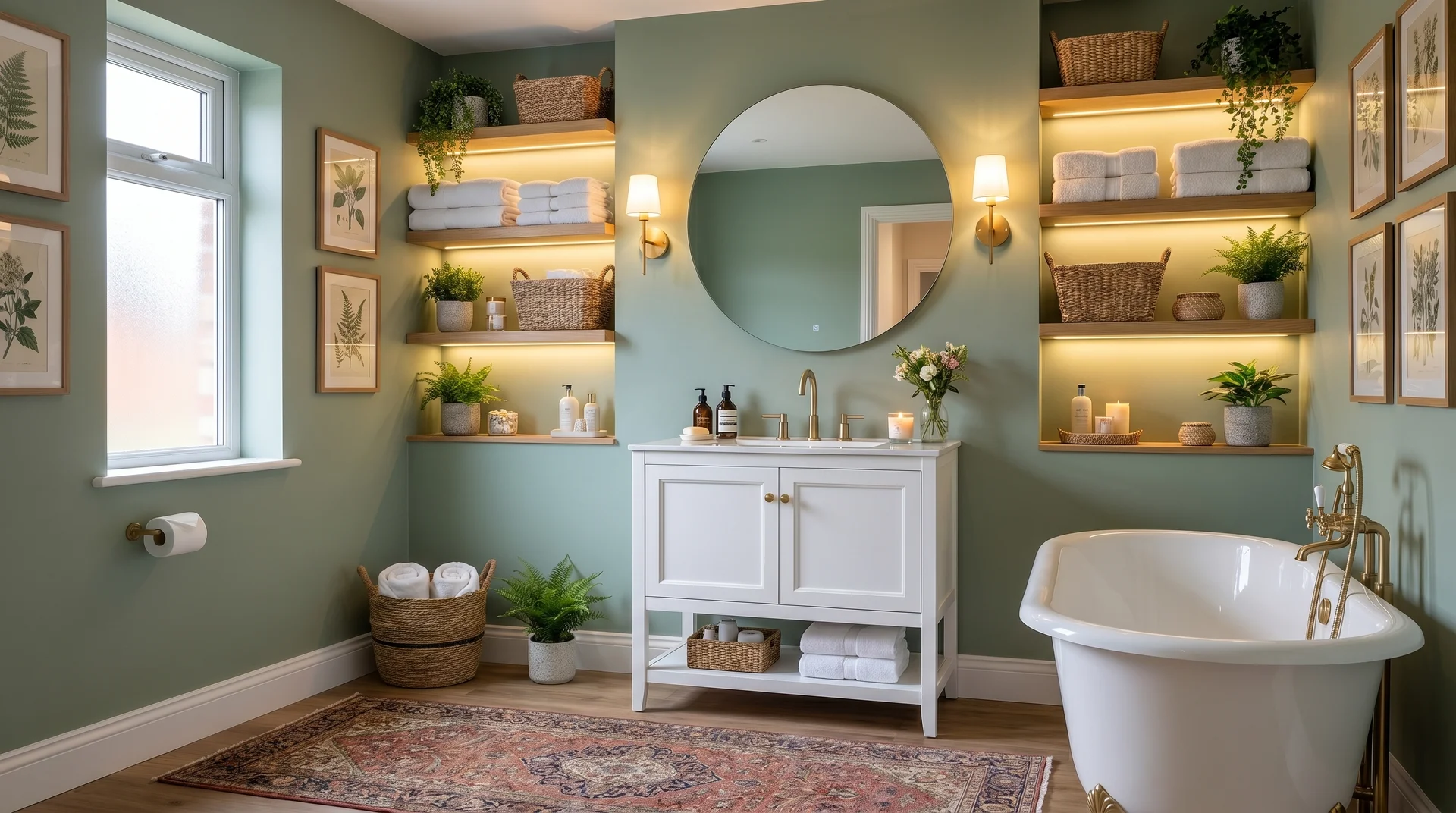
Green connects to plants, water, and outdoor spaces. Bring it into the bathroom, and the room feels more natural. A sage or soft botanical green stops the bathroom from feeling like a utility space.
Green shades worth trying:
| Green Paint Type | What It Does | Best For |
|---|---|---|
| Sage Green | Soft, muted, and versatile, it works well with both warm and cool tones. | Ideal for creating a calm, balanced atmosphere. |
| Moss Green | Richer and deeper, it pairs beautifully with terracotta tiles or warm wood tones. | Perfect for a grounded, organic look in the bathroom. |
| Soft Botanical Green | A fresh, muted green, between sage and mint. | Great for a subtle pop of color without being bold. |
Pro Tip: Avoid greens with too much yellow under warm bathroom lighting. A clean sage in the store can shift olive on the wall. Always test a sample under your specific light first.
Bold and Dramatic Colors for The Bathroom
Not every bathroom needs to feel light and airy. A guest bathroom, powder room, or small ensuite can handle a much stronger color. Going dark in a small space often works better than going light. It creates depth that pale colors cannot match.
5. Deep Blue and Charcoal
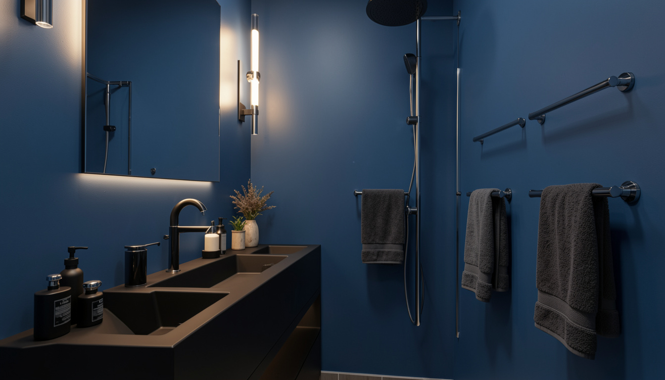
Dark bathroom walls feel risky. Most people avoid them. That’s exactly why they work well; they stand out and bring a level of depth that lighter colors can’t.
When a room is compact, dark walls soften the hard visual boundary between the wall and the corner. The room feels like it has no defined edges, which reads as more spacious, not less.
Dark shades that deliver:
| Dark Paint Type | What It Does | Best For |
|---|---|---|
| Deep Navy | Adds richness without being too dark, pairs well with brass fixtures and white marble tiles. | Ideal for bathrooms with warm lighting and a luxurious feel. |
| Midnight Blue | Softer than navy, still deep and calming. | Perfect for bathrooms that get natural light during the day but want a cozy, intimate feel at night. |
| Charcoal Grey | A bold, neutral tone that works in modern or industrial-style spaces. | Best for bathrooms with chrome, concrete tiles, and matte black fixtures. |
Pro Tip: Keep the ceiling light when using dark walls. A dark ceiling in a small bathroom feels heavy. Light above, dark walls, and good lighting create a balanced result.
6. Jewel-Toned Colors
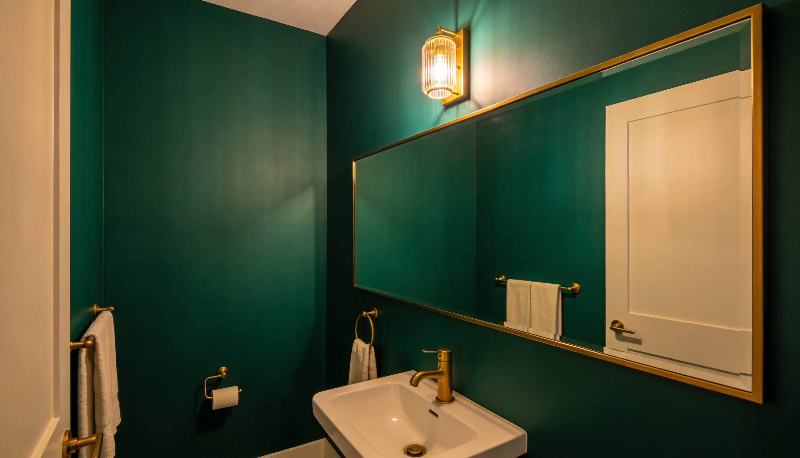
Powder rooms are small. Most people treat them like an afterthought. A powder room is actually the one space where bold color makes complete sense. Guests use it briefly. There’s no shower steam. You need less paint to make a big visual statement.
Jewel tones that work best:
| Bold Paint Type | What It Does | Best For |
|---|---|---|
| Emerald Green | Rich and deep, it pairs beautifully with gold or brass hardware. | Perfect for creating a luxurious, elegant feel in the bathroom. |
| Dusty Sapphire Blue | Sophisticated yet subtle, it adds depth without being overwhelming. | Ideal for pairing with white fixtures and warm metallic accents. |
| Deep Plum or Burgundy | Moody and intimate, it creates a cozy atmosphere. | Best for vintage-style bathrooms with unique, timeless fixtures. |
| Burnt Teal | A mix of green and blue, less common, creates a personalized vibe. | Great for bathrooms where you want a unique, bold, and personal touch. |
Pro Tip: Keep everything else simple in a jewel-toned powder room. White fixtures, one statement mirror, minimal decor. Let the color do the work.
Best Paint Colors for a Small or Windowless Bathroom
A small bathroom without a window is one of the trickier design challenges in any home. No natural light. Limited floor space. Walls that feel like they’re closing in.
1. Light Reflective Colors for Bathroom
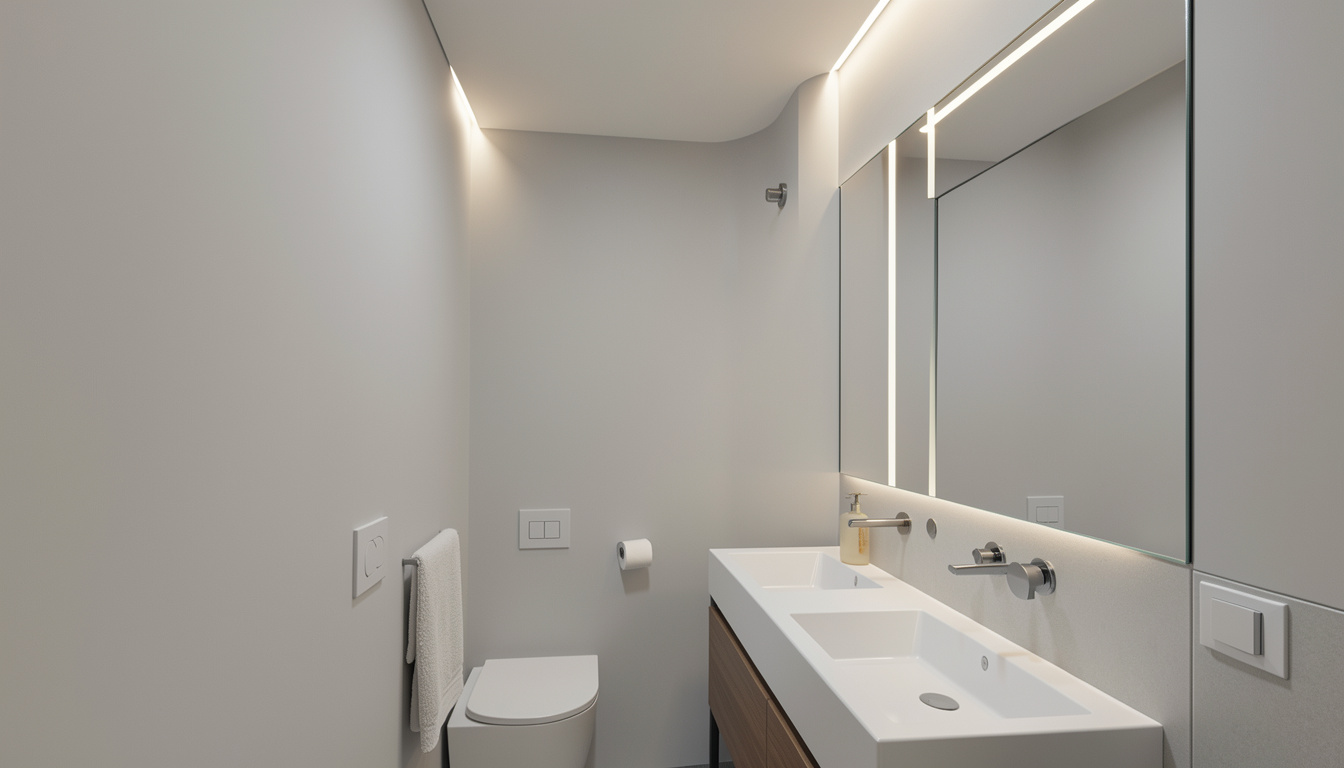
The most important thing a color can do in a small or windowless bathroom is reflect light rather than absorb it. Dark or saturated colors pull light in and hold it. Light, soft colors bounce artificial light, creating the illusion of more space.
Colors that reflect light most effectively:
| Warm Paint Type | What It Does | Best For |
|---|---|---|
| Soft Whites and Off-Whites | Works well with almost any light source, with minimal shift under artificial bulbs. | Ideal for creating a neutral, versatile bathroom space. |
| Pale Yellows | Mimic the warmth of natural sunlight, perfect for brightening up spaces. | Best for bathrooms that need to feel light and airy without additional lighting fixtures. |
| Light Peach and Blush Tones | Reflect warm light softly, adding brightness without harshness. | Perfect for creating a gentle, inviting atmosphere in bathrooms. |
A satin or semi-gloss finish reflects more light than flat or eggshell and handles moisture better.
Pro Tip: Paint the ceiling the same color as the walls, or one shade lighter. This removes the hard visual break between surfaces, making the room feel taller and more open.
2. Best Paint Colors for a Small Bathroom With No Windows
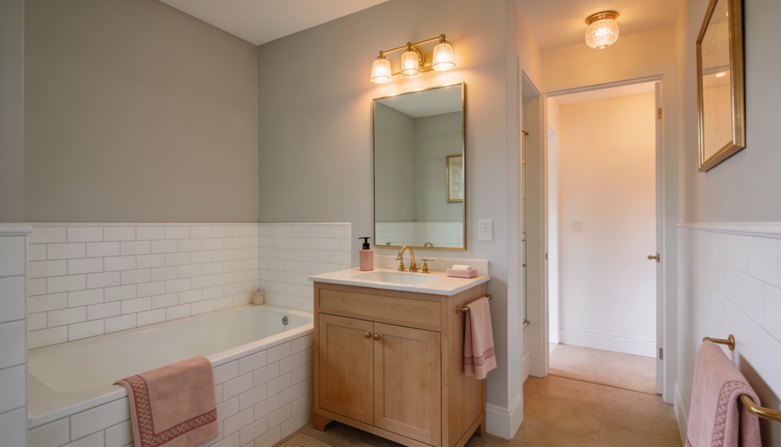
A windowless bathroom relies entirely on artificial light. Colors that look fresh under natural daylight can go flat, grey, or slightly green under bathroom lighting. You need shades specifically designed for artificial light performance.
Hues that hold up best without natural light:
| Warm Paint Type | What It Does | Best For |
|---|---|---|
| Warm White with Yellow Undertones | Stays warm under incandescent and warm LED bulbs, unlike blue-toned whites. | Ideal for bathrooms that need warmth without feeling cold under various lighting. |
| Soft Blush Pink | Adds warmth without making the room feel smaller. Under warm lighting, it feels fresh. | Perfect for creating a light, welcoming atmosphere with subtle warmth. |
| Very Light Greige with a Warm Base | Holds its tone well, doesn’t shift like cooler neutrals without natural light. | Great for bathrooms that need a soft, neutral base with warmth, even in low light. |
| Pale Gold or Butter Yellow | Mimics natural sunlight with a soft hue and low saturation for warmth. | Best for brightening up spaces with a warm, natural glow without overpowering the room. |
What to avoid in a windowless bathroom:
- Cool greys and blue-toned whites look flat and uninviting under artificial light
- Deep or saturated colors make a dim space feel even heavier
Pro Tip: Upgrade your light bulbs before you choose your paint. A warm LED bulb at 2700K to 3000K changes how colors look. Get the lighting right first, then test paint samples under that specific light.
Top Brand Picks for Best Paint Colors for The Bathroom
The best brands offer formulas with added moisture resistance and finishes that withstand daily steam and cleaning.
1. Benjamin Moore Colors
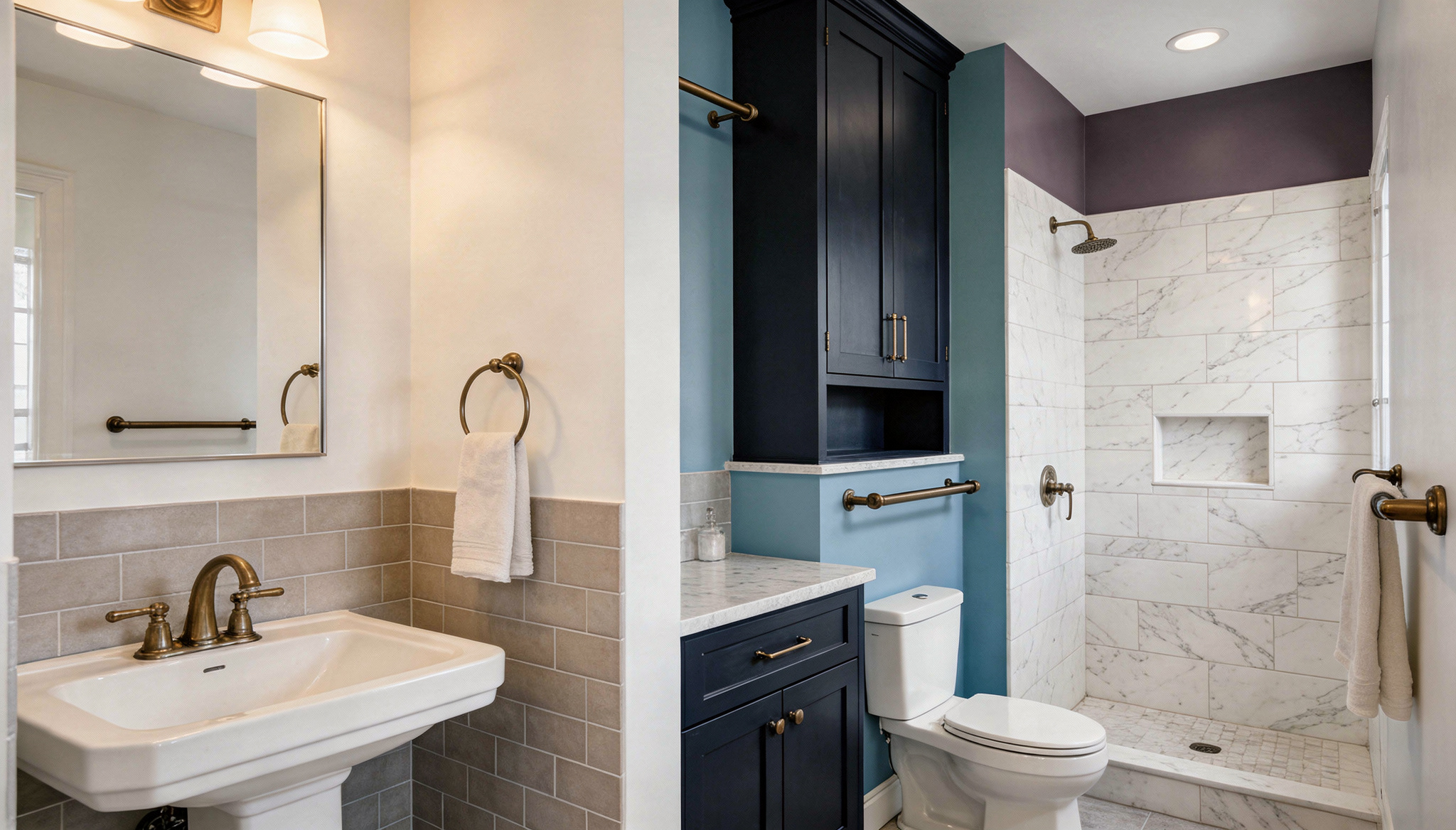
Benjamin Moore is a brand designers regularly turn to for bathroom projects, not just for the color range, but for the quality of the finish. Their bathroom-specific formula uses a soft matte finish that resists moisture without looking flat or chalky. It holds color well over time, even in steamy, high-use bathrooms.
What to look for in this range:
| Paint Color | What It Does | Best For |
|---|---|---|
| White Dove OC-17 | Warm white that stays creamy under artificial light without tipping yellow | Bathrooms need a soft, inviting atmosphere across all lighting conditions |
| Revere Pewter HC-172 | Warm greige that works with a wide range of tile and fixture combinations | Versatile bathrooms with multiple design elements |
| Palladian Blue HC-144 | Muted blue-green that brings calm without feeling too cool | Creating a serene, balanced environment in any bathroom |
| Hale Navy HC-154 | Deep, sophisticated navy with gray undertones | Powder rooms and guest bathrooms need richness and depth |
Pro Tip: Their bathroom-specific paint line is worth using over the standard interior formula. The finish is built for high-humidity spaces and holds up to regular cleaning without wearing down quickly.
2. Sherwin-Williams Colors
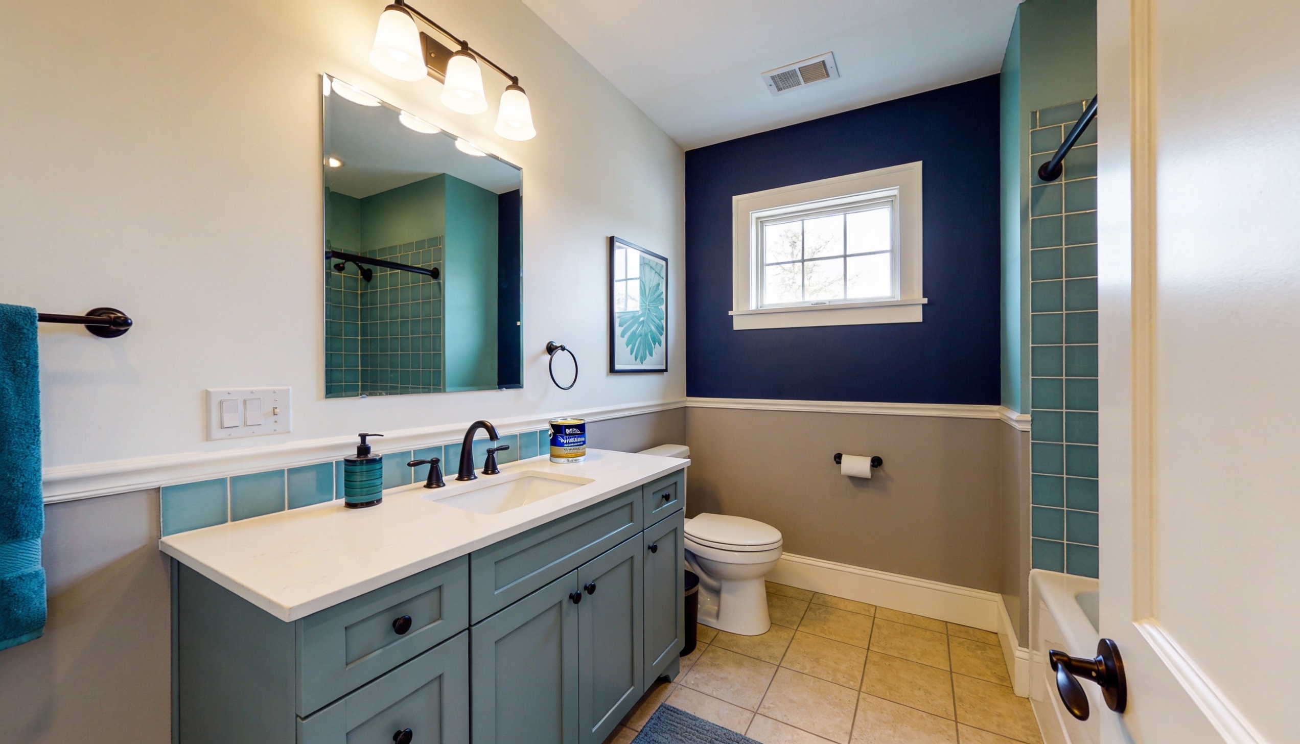
Sherwin-Williams offers one of the widest color ranges available. Their bathroom-specific formula includes mold- and mildew-resistance, which is worth paying attention to in any bathroom, especially one with poor ventilation.
The color categories that perform best:
| Paint Color | What It Does | Best For |
|---|---|---|
| Alabaster SW 7008 | Warm creamy white that holds softness under both natural and artificial light | Bathrooms need a consistent, inviting tone throughout the day |
| Agreeable Gray SW 7029 | Warm greige is flexible enough to work with almost any tile, vanity, or fixture | Creating a neutral, adaptable bathroom style |
| Sea Salt SW 6204 | Soft blue-green that sits between grey and blue, calm and easy to live with | Creating a tranquil, soothing bathroom environment |
| Naval SW 6244 | Rich, deep navy that adds depth and sophistication | Smaller bathrooms and powder rooms need a luxurious feel |
Pro Tip: Their premium bathroom paint line costs more than the standard range, but in a bathroom, it’s a smart call. The formula resists moisture, mold, and mildew, so you won’t need to repaint in 2 years.
How to Pick the Best Paint Color for a Bathroom
Choosing a color from a paint chip is one thing. Getting it right on your actual bathroom wall is another. Lighting, tile, fixtures, and room size all affect how a color performs on the wall.
1. Consider Lighting when Choosing the Color for The Bathroom
Lighting is the single biggest factor that affects how a paint color looks in a bathroom. The same shade can look completely different depending on whether your light source is natural, warm artificial, or cool fluorescent.
How different light types affect color:
- North-facing natural light is cool and consistent. It makes warm colors look more muted.
- South-facing natural light is warmer and brighter. It brings out warmth in beiges and whites.
- Warm LED bulbs at 2700K to 3000K bring out yellow and red undertones. Cool greys can shift slightly green.
- Cool LED bulbs at 4000K to 5000K flatten warm tones and make cool colors stand out more.
Paint a sample at least 12 inches by 12 inches directly on the wall. Look at it at different times of day and under your bathroom lighting at night. Color on a screen and color on a wall are two entirely different things.
2. Pairing Best Paint Colors for Bathroom With Fixtures and Tile
Your paint color shares the room with your tiles, vanity, mirror frame, and fixtures. Getting the pairing right makes the whole bathroom feel pulled together.
How to match paint with fixtures and tiles:
| Fixture/Tile Type | Best Wall Color Pairing | Description |
|---|---|---|
| White Fixtures and Tiles | Match the undertone of the wall color | Most forgiving, adaptable to any wall color as long as the undertones match. |
| Grey or Concrete-Look Tiles | Soft blues, warm whites, charcoal, muted greens | Works well with a modern, industrial vibe. |
| Warm Wood Vanities | Sage green, creamy white, warm greige | Complements warm wood tones with earthy, soft colors. |
| Brass and Gold Fixtures | Creamy whites, warm greens, deep navy, jewel tones | Enhance the luxury and warmth of gold and brass with rich, warm colors. |
| Chrome and Nickel Fixtures | Cool, neutral tones, soft blues, greys, crisp white | Pair perfectly with cool-toned walls for a sleek, clean finish. |
| Matte-Black Fixtures | Light-neutral walls, deep moody tones | Sharp, bold contrast with light neutrals or deep, sophisticated colors. |
Pro Tip: Hold a paint chip directly against your tile and fixtures in your bathroom, not a showroom. The real relationship between colors only shows up in the actual space.
Frequently Asked Questions
Can I use two colors in a bathroom?
Yes. A common approach is to paint the lower half of the wall a darker shade and the upper half a lighter one, divided by a chair rail or trim strip. Keep both tones in the same color family so the room feels connected rather than split.
Does light blue paint increase home resale value?
A 2021 Zillow study found that homes with light blue bathrooms sold for more than $5,000 above their expected price. It’s one of the few paint colors with documented resale impact, likely because pale blue reads as clean, calm, and buyer-friendly.
What paint color works best for a kids’ bathroom?
Bright yellows, soft greens, and playful pastels work well. They feel fresh and energetic without being too loud. Avoid colors you’d use in a grooming space. Strong colors can distort how skin tones appear in the mirror.
Is matte paint okay for bathrooms?
Matte and flat finishes are not a good fit for bathrooms. They absorb moisture, are harder to clean, and can harbor mold over time. Stick to satin or semi-gloss for walls and ceiling alike.
What is color drenching in a bathroom?
Color drenching means painting the walls, ceiling, and sometimes trim all in the same shade. In a small bathroom, this removes visual breaks between surfaces, making the room feel more open and intentional rather than cramped.
What finish is best for bathroom paint?
Satin and semi-gloss are the two best finishes for bathrooms. Both handle moisture well, clean up easily, and reflect light better than flat or eggshell finishes. Semi-gloss is slightly more durable in high-use bathrooms.
The Right Color Is the One That Works in Your Space
Paint color is one of the smallest changes you can make to a bathroom. It’s also one of the most noticeable.
This article covered the main color directions: crisp whites, warm greiges, soft blues, sage greens, deep navies, jewel tones, and shades built for windowless rooms. Each works best when matched to your specific lighting, fixtures, and room size. That’s the part most paint decisions skip.
If you’re working on a larger update at the same time, these budget-friendly bathroom remodel ideas cover what to tackle first and what gives you the most return for your effort.
The best bathroom paint color is not the most popular one. It’s the one that works with your specific space.