Small house, big dreams. Your kitchen and living room share one space, but right now it feels cramped and messy.
Cooking while guests sit three feet away? That’s awkward. Clutter is everywhere because there’s nowhere to hide it? Frustrating.
Open-concept layouts can make tiny homes feel twice their size. The secret is knowing which design tricks work and which ones waste your limited space.
In this post, you’ll learn how to plan your layout, specific design ideas with real pros and cons, lighting strategies that create invisible zones, and the top mistakes that make small spaces feel even smaller.
Let’s turn that cramped combo into a space you’ll love.
How to Design a Small House Open Kitchen Living Room
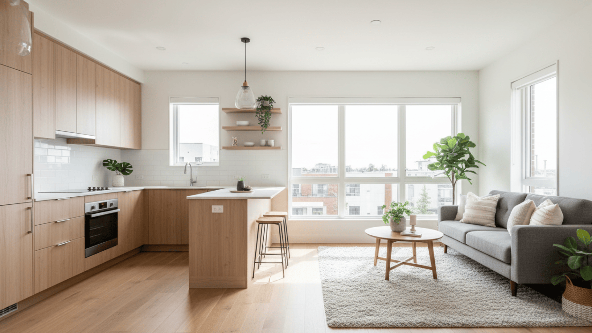
Designing an open-concept layout in a small house requires careful planning. You want both spaces to work well together while keeping their own purpose. The key is creating flow without making the area feel crowded. Smart choices in layout, color, and furniture can make your small space feel twice its size.
- Space Planning Basics: Start by measuring your entire area and marking where you cook, eat, and relax. Keep at least 3 to 4 feet of walking space between your kitchen counters and living room furniture.
- Choosing Zones Without Walls: Use furniture placement to create invisible boundaries between your kitchen and living area. A sofa back, area rug, or kitchen island can separate spaces without blocking light or views.
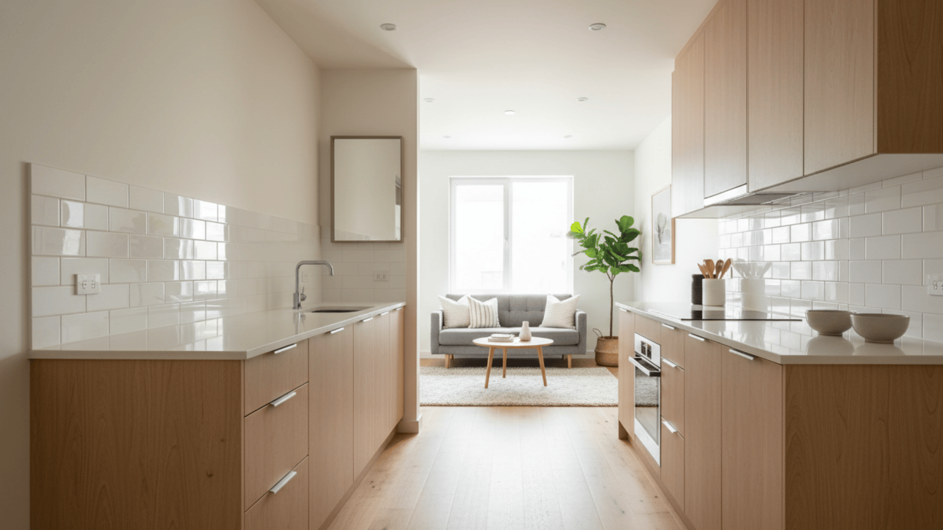
- Unifying Flooring and Color Palettes: Pick the same flooring throughout both spaces to make the area look larger and connected. Stick to 2 or 3 main colors that flow from the kitchen cabinets to the living room walls.
- Balancing Storage With Openness: Add tall cabinets and hidden storage in your kitchen to keep counters clear. Use furniture with built-in storage, like ottomans or coffee tables with drawers, to avoid clutter.
- Using Lighting and Furniture Strategically: Layer different types of lighting: overhead lights in the kitchen, floor lamps in the living room, and pendant lights over eating areas. Choose furniture that fits the scale of your room, not oversized pieces that crowd the space.
27 Small House Open Concept Kitchen and Living Room Ideas
Ready to see these design principles in action? Here are 27 specific ideas that work in real small homes, complete with honest pros and cons for each layout.
1. One-Wall Kitchen With Open Living Area
A one-wall kitchen lines up all appliances, cabinets, and counters along a single wall. This layout leaves the rest of your space completely open for living room furniture. It works best in studio apartments or very small homes where every inch counts.
| Pros | Cons |
|---|---|
| Maximum floor space for the living area | Limited counter and storage space |
| Simple, clean look | Can feel cramped when cooking |
| Budget-friendly to install | Not ideal for multiple cooks |
| Easy traffic flow | Minimal workspace |
Design Tip: Add a narrow rolling cart for extra prep space that you can tuck away when not cooking.
2. L-Shaped Kitchen that Wraps Into the Living Area
An L-shaped kitchen uses two adjoining walls to create a natural corner workspace. The open side faces your living room, creating a natural flow between both areas. This layout gives you more counter space than a one-wall design.
| Pros | Cons |
|---|---|
| More counter and storage space | Takes up two walls |
| Creates a work triangle | Corner cabinets can be hard to reach |
| Natural separation from the living area | Needs careful furniture placement |
| Good for entertaining | Can block natural light |
Design Tip: Install corner drawers or a lazy Susan in the corner cabinet to make that space more useful.
3. U-Shaped Kitchen Opening Into a Cozy Lounge
A U-shaped kitchen surrounds you with counters on three sides and opens to the living room on the fourth. This layout gives you the most workspace and storage in a small footprint. Your living area sits right outside the U, creating a cozy, defined space.
| Pros | Cons |
|---|---|
| Maximum counter and cabinet space | Can feel closed off from the living room |
| Efficient work triangle | Takes up three walls |
| Keeps cooking mess contained | Not great for small spaces under 150 sq ft |
| Lots of storage options | Can make a room feel smaller |
Design Tip: Keep the living room side open, with no upper cabinets, to maintain a visual connection.
4. Small Galley Kitchen Opening to the Living Room
A galley kitchen features two parallel counters with a walkway between them. One end opens directly into your living room, rather than having a wall or door. This creates a straight line of sight from the kitchen to the living space.
| Pros | Cons |
|---|---|
| Efficient for cooking | Can create a tunnel effect |
| Everything within reach | Only one entry/exit point |
| Good use of narrow spaces | Limited space for multiple people |
| Clear pathway to the living room | Traffic can disrupt cooking |
Design Tip: Use light colors on both walls and add a mirror at the far end to prevent the tunnel feeling.
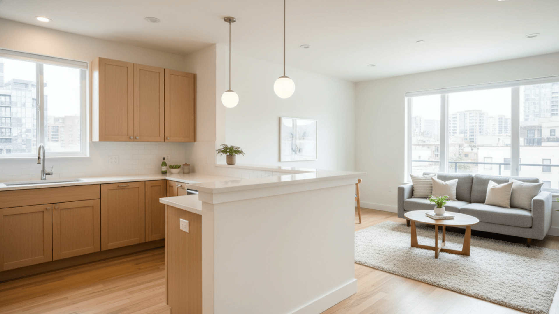
5. Peninsula Divider for Compact Homes
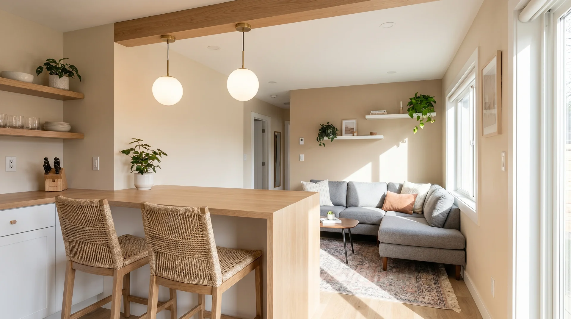
A peninsula is a connected counter that juts out from your kitchen, creating a partial divider. It acts like an island but connects to your main counter or wall. The peninsula faces your living room and can include bar seating.
| Pros | Cons |
|---|---|
| Adds extra seating | Reduces floor space |
| Creates subtle separation | Can block sight lines if too high |
| More counter space | Permanent fixture |
| Doubles as a breakfast bar | Makes furniture arrangement tricky |
Design Tip: Keep the peninsula height at 42 inches, with an overhang, for comfortable bar stool seating.
6. Floating Kitchen Island as a Soft Divider
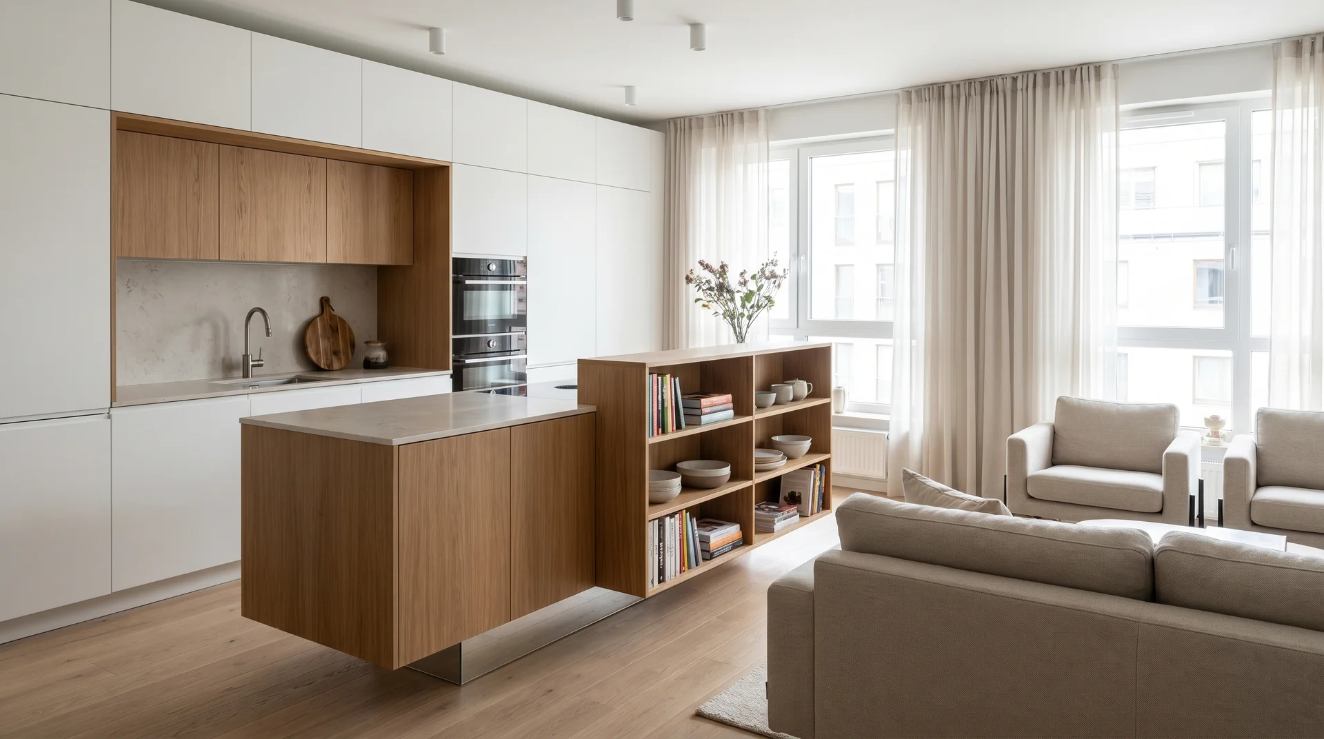
A floating island sits between your kitchen and living room without touching any walls. It creates a gentle boundary while keeping the space open and airy. You can walk around all sides, making it perfect for small gatherings.
| Pros | Cons |
|---|---|
| Defines space without blocking views | Needs adequate floor space |
| Adds prep and storage space | Can interrupt traffic flow |
| Provides casual seating | Requires proper electrical planning |
| Flexible positioning | Less stable than the peninsula |
Design Tip: Choose an island that’s 36 inches high for prep work or 42 inches for bar-style seating.
7. Mobile/Portable Island for Multi-Use Living Rooms
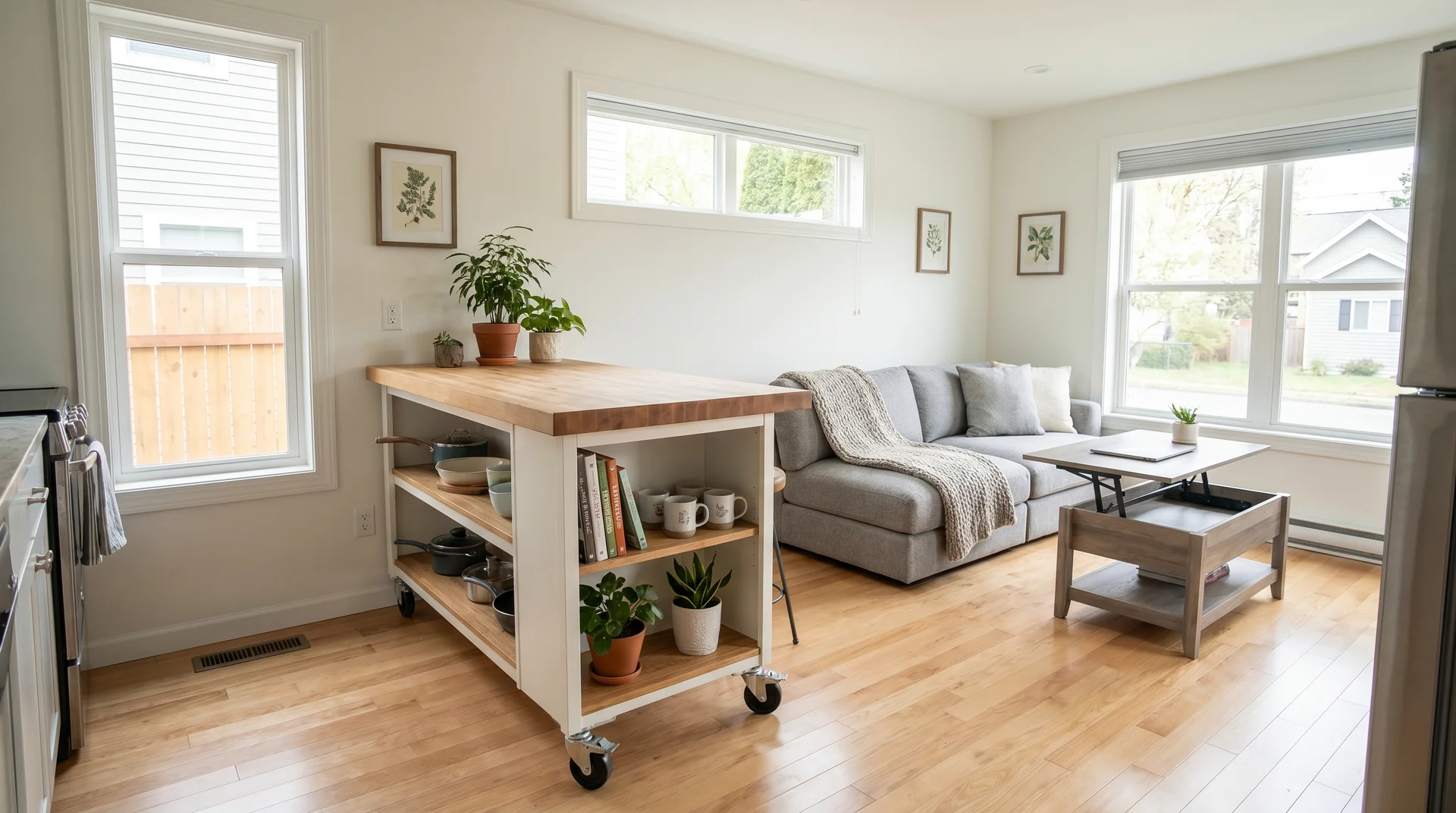
A mobile island on wheels gives you the flexibility to move it where you need it. Roll it near your stove while cooking, then move it to the living area as a coffee or side table. This works great in very small spaces that serve multiple purposes.
| Pros | Cons |
|---|---|
| Maximum flexibility | Can feel unstable |
| Easy to store when not needed | Limited weight capacity |
| Affordable option | Wheels can scratch floors |
| Can serve multiple purposes | Usually smaller than fixed islands |
Design Tip: Look for locking wheels and a butcher block top that can double as a cutting surface.
8. Built-In Banquette Dining Between Kitchen & Living Room
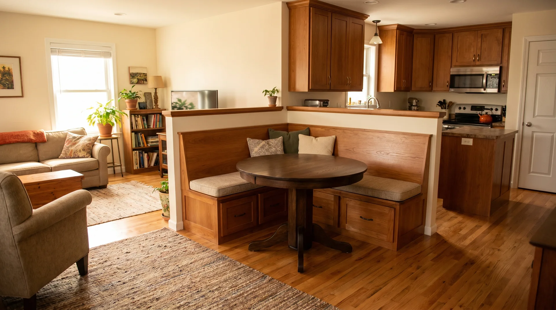
A built-in banquette is a bench seat with a table that sits between your kitchen and living room. It creates a cozy dining nook that separates both spaces without walls. The bench usually includes storage underneath the seats.
| Pros | Cons |
|---|---|
| Saves space compared to chairs | Permanent installation |
| Adds storage underneath | Less flexible seating |
| Creates clear zones | It can feel tight for some people |
| Cozy, intimate dining | Hard to clean underneath |
Design Tip: Add cushions in colors that match your living room to visually tie both spaces together.
9. Open Shelving That Connects Both Spaces
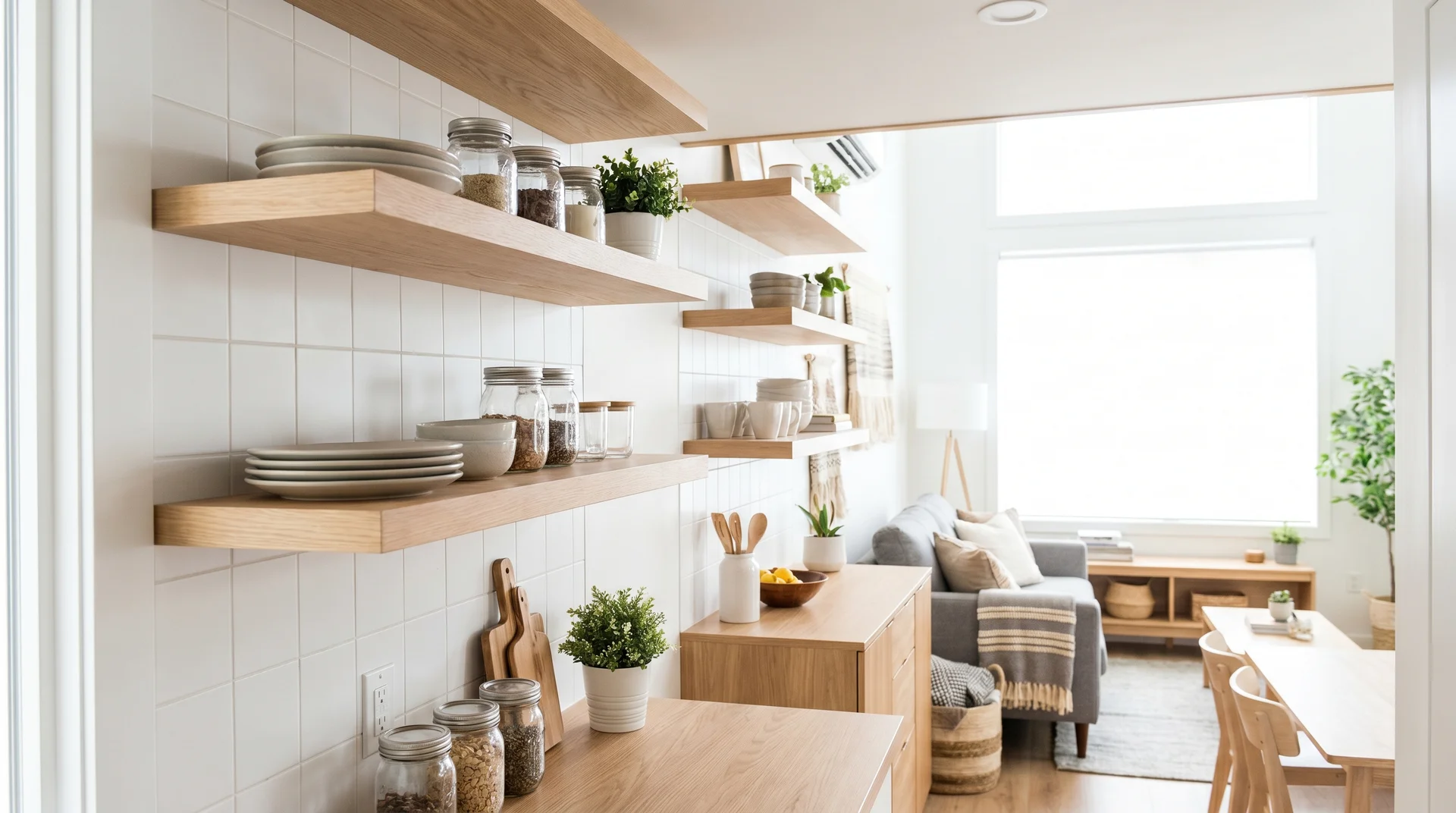
Open shelving replaces some or all upper cabinets in your kitchen. The shelves display dishes, glasses, and decor that flow into your living room style. This creates visual continuity and makes both areas feel like one cohesive space.
| Pros | Cons |
|---|---|
| Makes space feel larger | Items get dusty quickly |
| Easy to access dishes | Everything stays on display |
| Shows off pretty dishware | Requires organized, matching items |
| Less expensive than cabinets | Less storage capacity |
Design Tip: Mix kitchen items with books or plants to blur the line between kitchen and living room.
10. Half-Wall or Pass-Through for Semi-Open Feeling
A half-wall or pass-through window sits between your kitchen and living room at counter height. It provides some separation while maintaining openness and conversation flow. You can pass dishes through or use it as a serving counter.
| Pros | Cons |
|---|---|
| Hides kitchen mess from view | Still creates some barrier |
| Provides extra counter space | Reduces full openness |
| Maintains conversation flow | Can collect clutter |
| Easier than a full remodel | Needs structural support |
Design Tip: Add pendant lights above the pass-through to highlight it as a feature and provide task lighting.
11. Vaulted or Higher Ceilings to Create Spaciousness
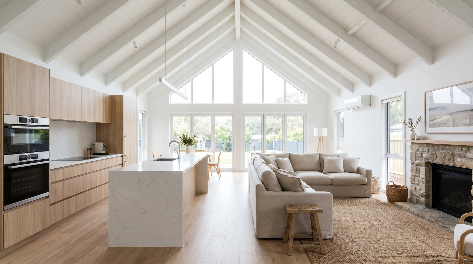
Vaulted or raised ceilings angle upward rather than remaining flat. This vertical space makes your small open concept feel much larger than it actually is. Higher ceilings also allow more natural light to spread throughout both areas.
| Pros | Cons |
|---|---|
| Makes the room feel much bigger | More expensive to heat/cool |
| Brings in more natural light | Higher construction costs |
| Adds architectural interest | Can make furniture look small |
| Improves air circulation | Hard to change light bulbs |
Design Tip: Paint the ceiling white or light cream to maximize the feeling of height and space.
12. Extended Countertop Bar Facing the Living Room
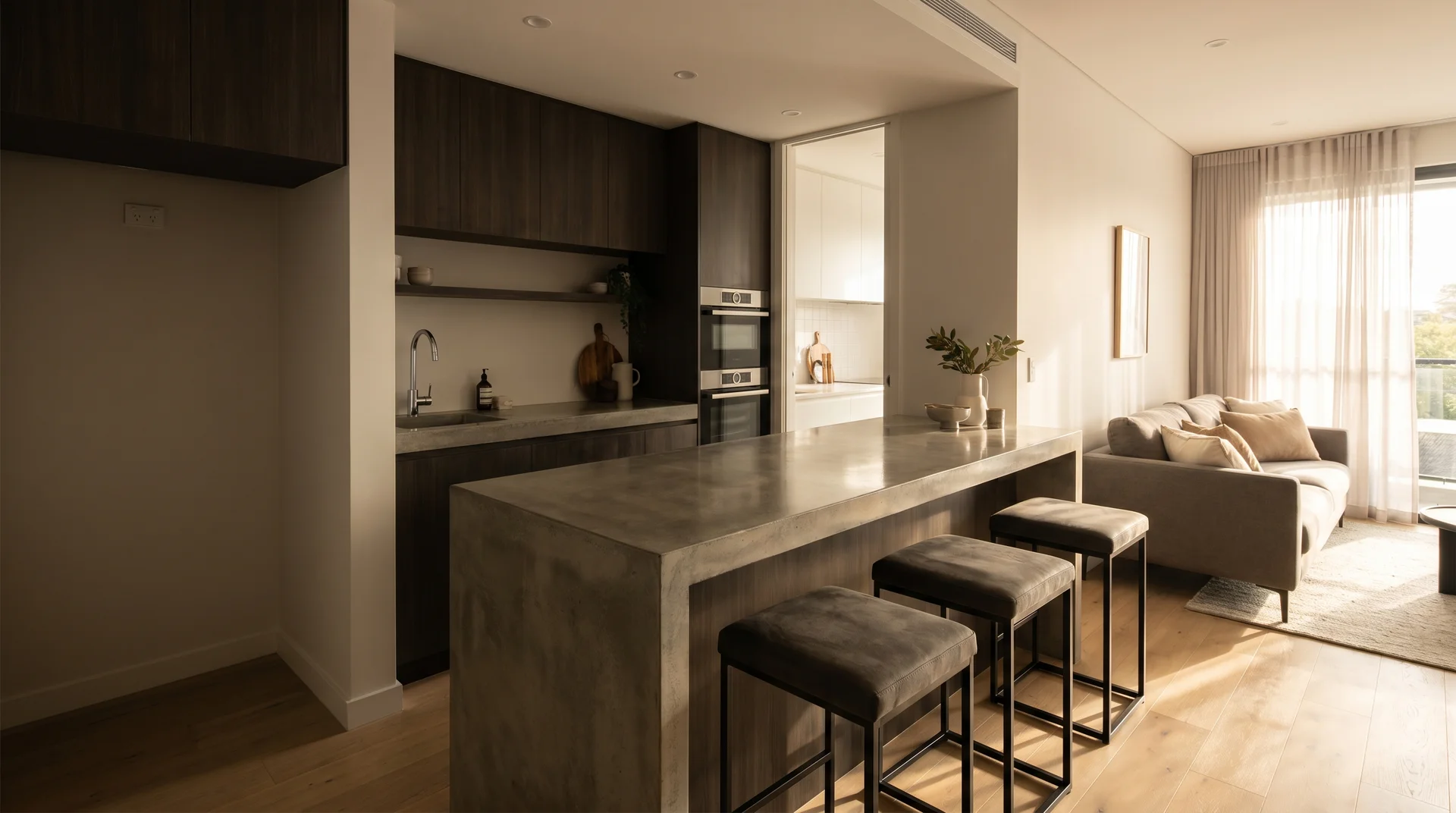
An extended countertop juts out from your main kitchen counter and faces the living room. It creates a casual eating area where people can sit on stools and chat while you cook. This works as both prep space and social hub.
| Pros | Cons |
|---|---|
| Great for entertaining | Takes up floor space |
| No separate dining table needed | Stools can look cluttered |
| Easy meal service | Crumbs fall on the living room side |
| Adds extra workspace | Can block walkways |
Design Tip: Use a waterfall edge where the counter material flows down the side for a modern, polished look.
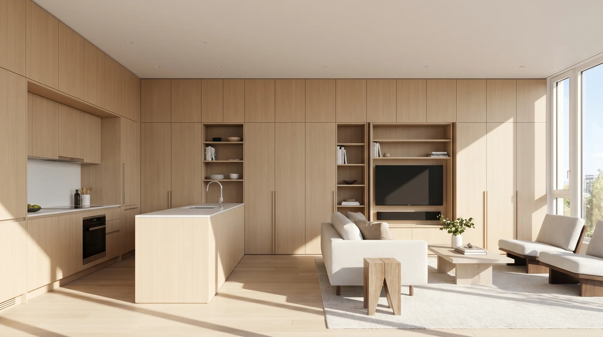
13. Minimalist Kitchen With Concealed Appliances
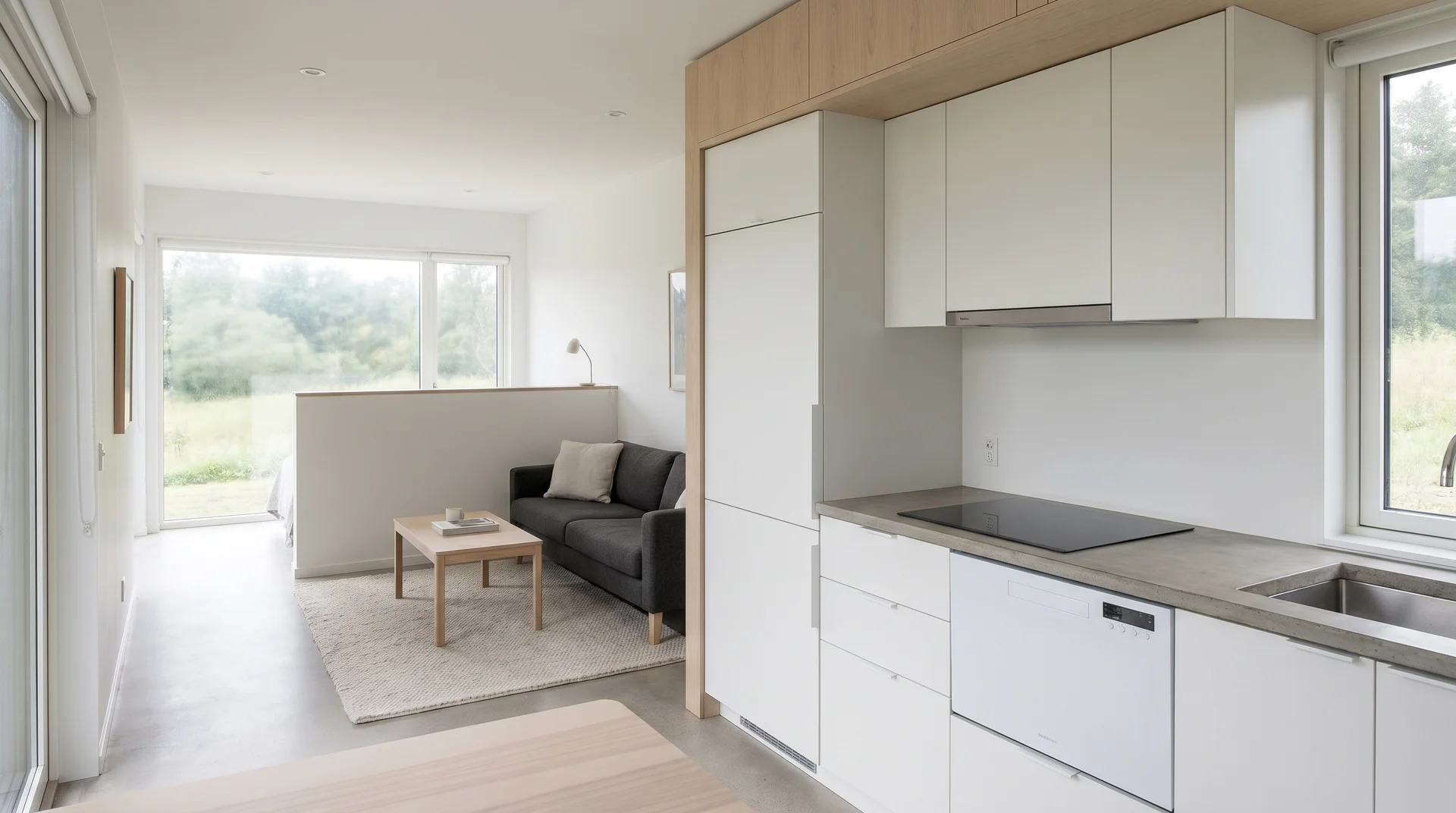
A minimalist kitchen hides appliances behind cabinet panels so they blend in completely. Your refrigerator, dishwasher, and even microwave disappear into the cabinetry. This creates a clean, uncluttered look that flows into your living room.
| Pros | Cons |
|---|---|
| Ultra clean appearance | More expensive appliances |
| The living room remains the focal point | It can be hard to find appliances |
| Timeless style | Limits appliance choices |
| Makes a small space feel bigger | Installation costs more |
Design Tip: Add small handle-less cabinets with push-to-open mechanisms to complete the streamlined look.
14. Living Room Accent Wall That Defines the Space
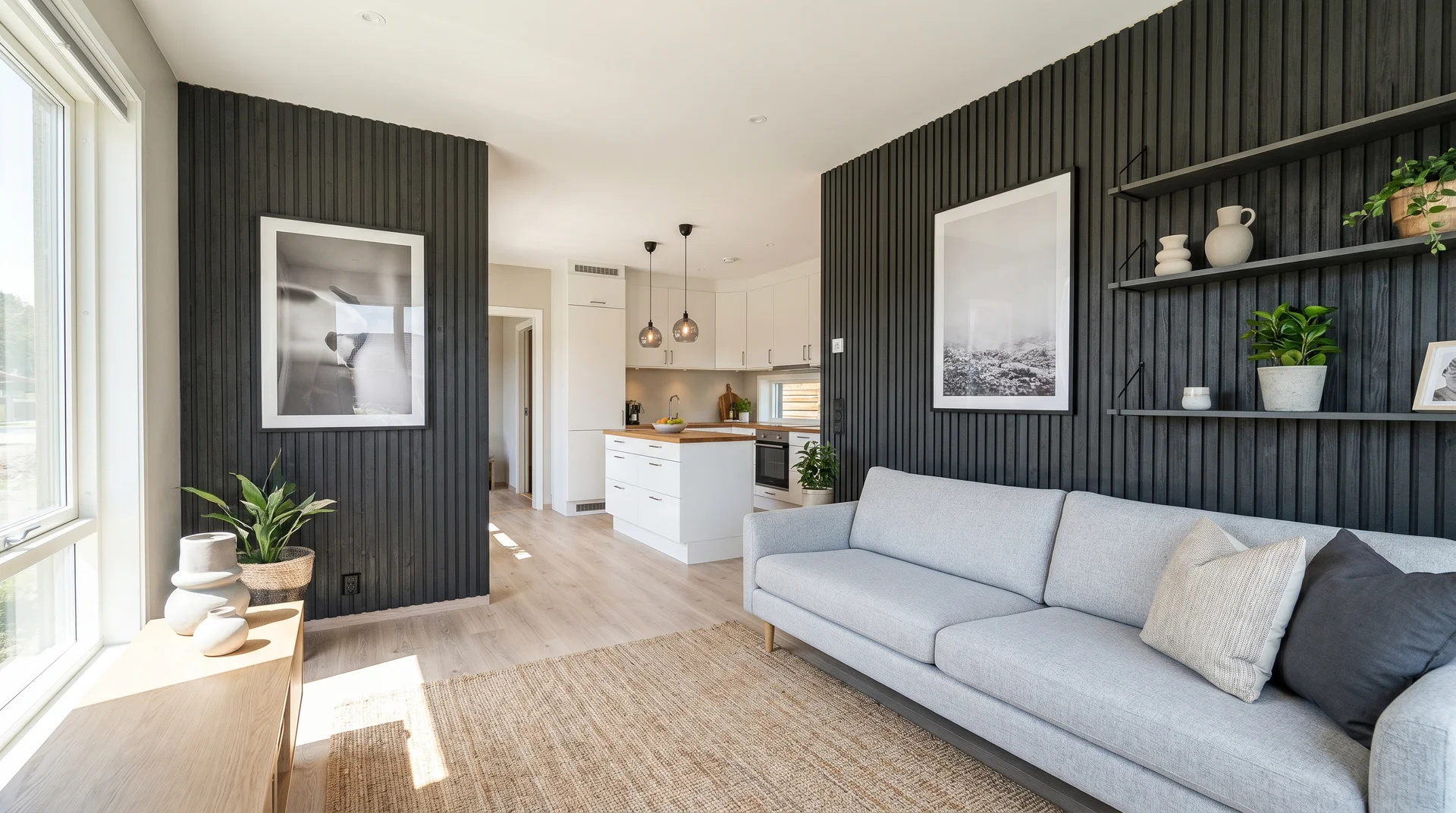
An accent wall uses a different color, texture, or material behind your sofa or TV. This creates a visual anchor for the living room, separating it from the kitchen. The wall defines the space without needing any physical barriers.
| Pros | Cons |
|---|---|
| Clear visual separation | Can make space feel choppy |
| Adds personality and style | The wrong color can shrink the room |
| Budget-friendly option | Needs repainting when tired of it |
| Easy DIY project | May not match future furniture |
Design Tip: Choose a color that appears in small amounts in your kitchen backsplash or decor to tie spaces together.
15. Glass or Sliding Doors to Bring Natural Light Deeper
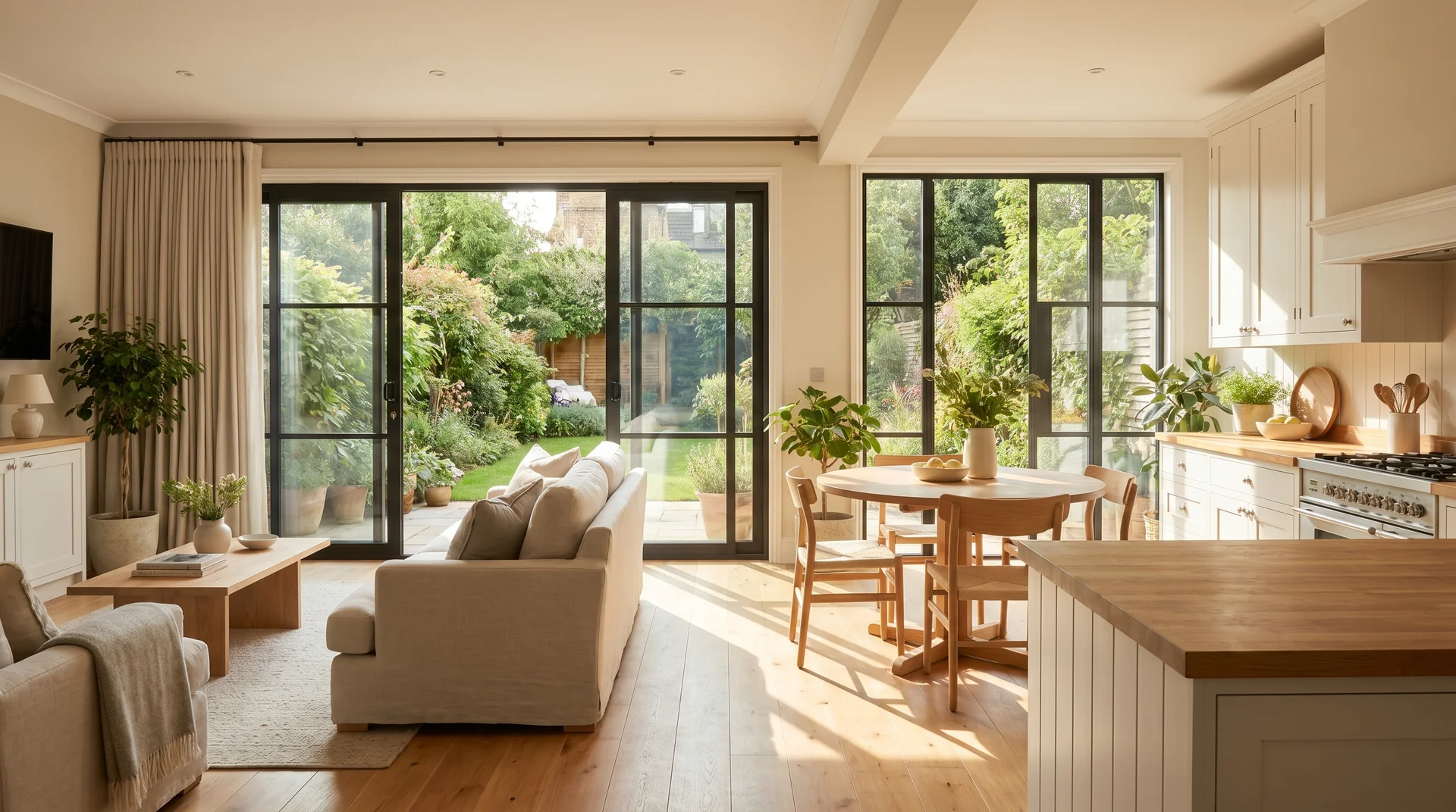
Glass or sliding doors on an exterior wall flood your open space with natural light. The light travels from the living room straight through to the kitchen. This makes the entire area feel bright, open, and connected to the outdoors.
| Pros | Cons |
|---|---|
| Dramatically increases natural light | Can increase heating/cooling costs |
| Makes space feel larger | Less privacy |
| Easy outdoor access | More expensive than regular doors |
| Improves mood and energy | Needs regular cleaning |
Design Tip: Hang light, sheer curtains that you can close at night but still allow maximum daylight during the day.
16. Light Color Palette for Visual Expansion
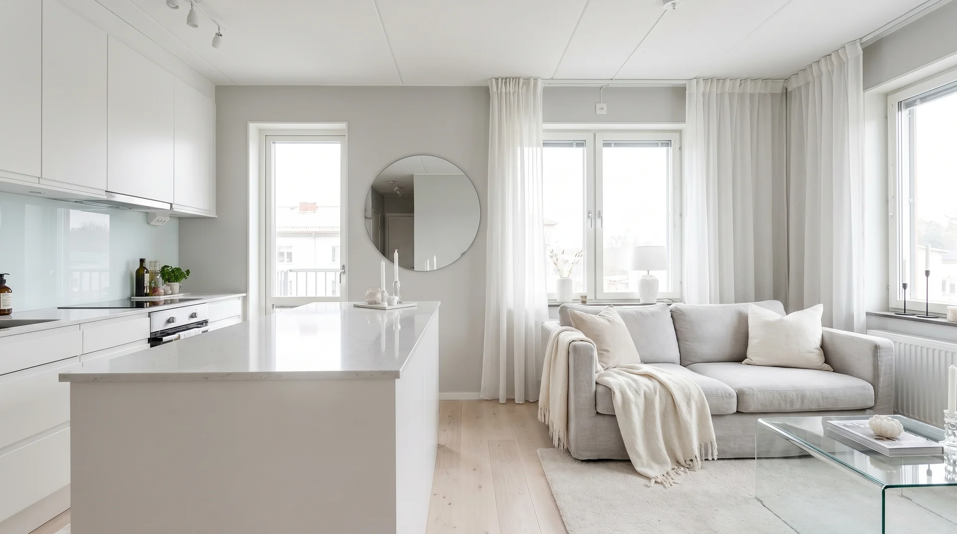
A light color palette uses whites, creams, light grays, and soft pastels throughout your space. These colors reflect light and make walls seem to recede. Your kitchen cabinets, walls, and living room furniture all fall within the same light-toned family.
| Pros | Cons |
|---|---|
| Makes space look bigger | Can feel cold or sterile |
| Reflects more light | Shows dirt and stains easily |
| Creates a calm atmosphere | May lack personality |
| Easy to match decor | It can look washed out without contrast |
Design Tip: Add warmth with wood tones in flooring or furniture so the space doesn’t feel too clinical.
17. Bold Two-Tone Cabinets to Add Personality
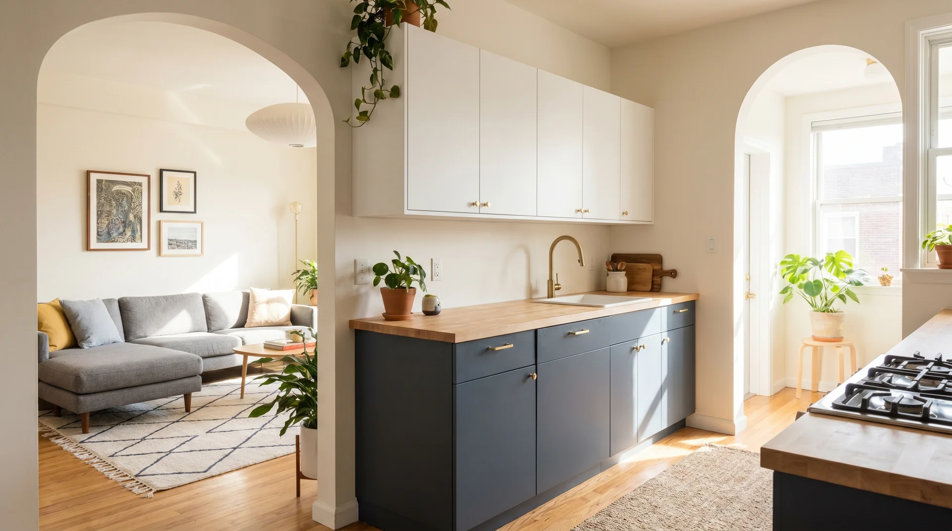
Two-tone cabinets use different colors for upper and lower kitchen cabinets. This adds visual interest and personality to your kitchen without overwhelming the space. The contrast creates a focal point that defines the kitchen area.
| Pros | Cons |
|---|---|
| Adds character to the space | Can look dated quickly |
| Creates visual separation | Harder to resell |
| Hides wear on the lower cabinets | Needs careful color selection |
| Modern, trendy look | More complex to paint/refinish |
Design Tip: Keep upper cabinets light and lower cabinets darker to make the ceiling appear higher.
18. Multi-Functional Furniture (Sofa Tables, Lift-Top Coffee Table)
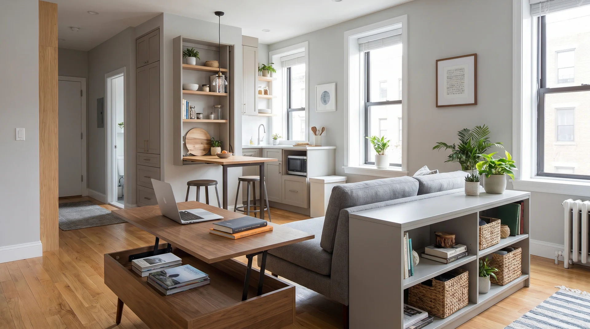
Multi-functional furniture serves more than one purpose in your space. A sofa table provides storage and display space behind your couch. A lift-top coffee table raises up to accommodate dining or work from your sofa.
| Pros | Cons |
|---|---|
| Saves space | It can be more expensive |
| Reduces furniture needs | May not do any one thing perfectly |
| Adds storage | Moving parts can break |
| More flexible use | Often heavier than regular furniture |
Design Tip: Choose a console table behind your sofa that’s the same height as the back for a built-in look.
19. Narrow but Long Layout With Continuous Flooring
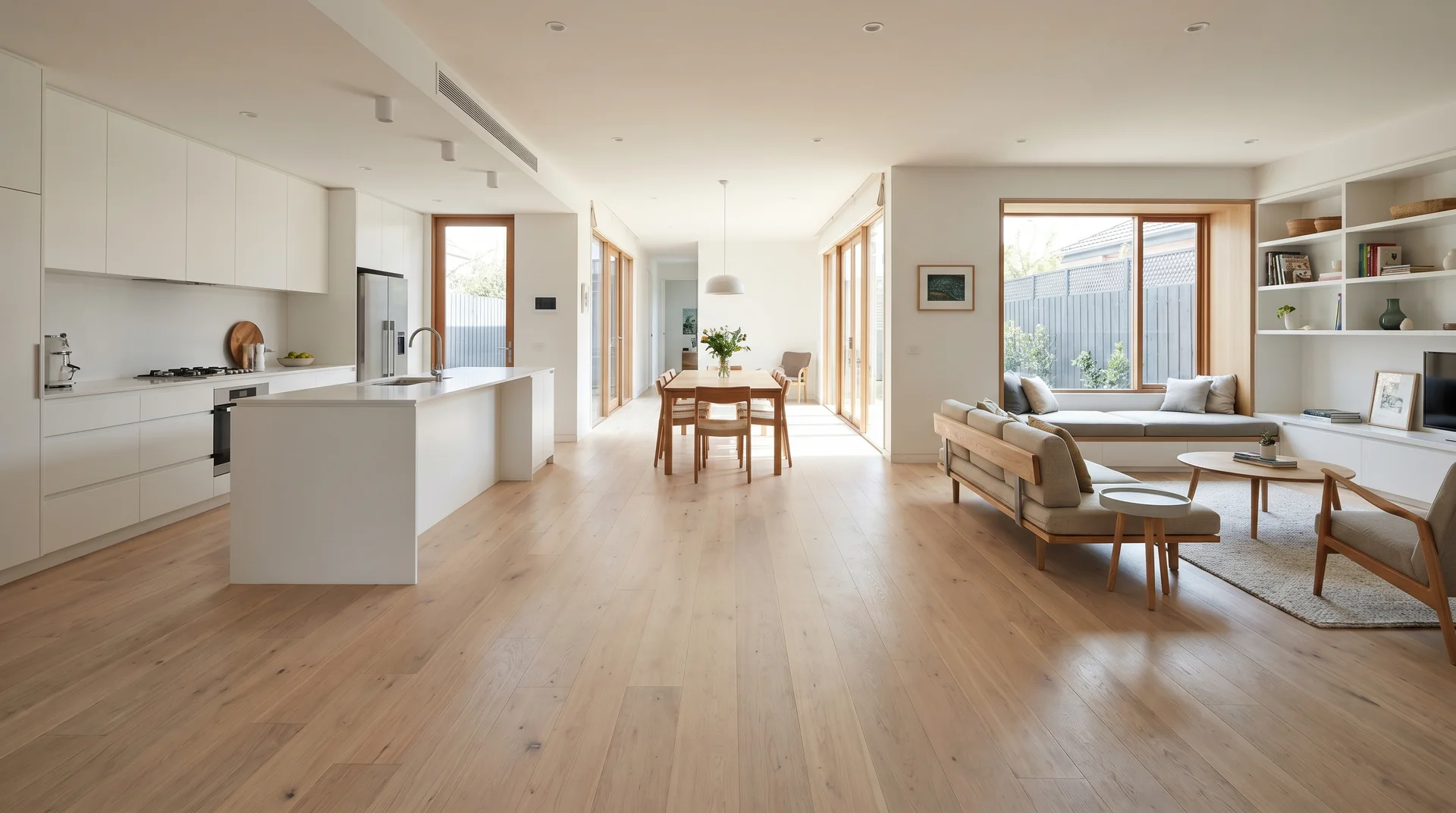
A narrow, long layout runs your kitchen and living room in a line from front to back. The same flooring material runs the entire length without any breaks. This creates a visual pathway that makes the space feel longer and more cohesive.
| Pros | Cons |
|---|---|
| Makes space feel longer | It can feel like a hallway |
| Natural traffic flow | Furniture placement is tricky |
| Works in tight spaces | Everything is visible from one end |
| Easy to clean | Limited layout options |
Design Tip: Place your sofa perpendicular to the length of the room to break up the long sightline and create zones.
20. Add a Rug to Define the Living Space
A large area rug under your living room furniture creates a clear boundary without walls. The rug defines where the living area begins and the kitchen ends. It adds warmth, texture, and visual interest to the open floor plan.
| Pros | Cons |
|---|---|
| Easy, affordable solution | Can trip people |
| Adds color and texture | Needs regular cleaning |
| Can change easily | May slide around |
| Absorbs sound | Can make a small space feel smaller |
Design Tip: Choose a rug large enough for at least the front legs of all living room furniture to sit on it.
21. Mirror Placement to Double the Room Visually
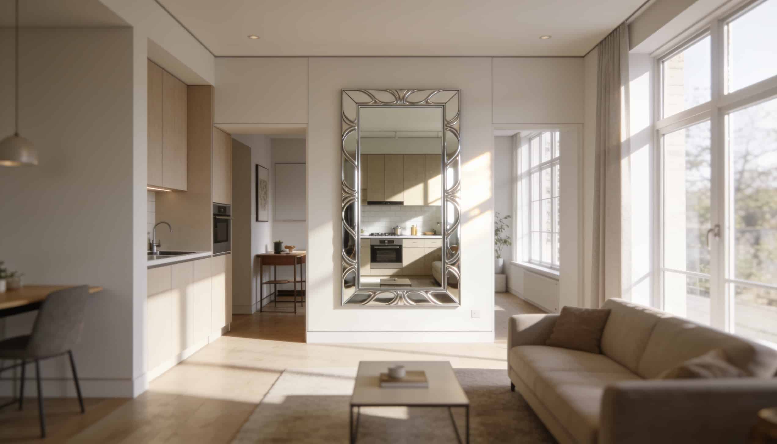
Mirrors placed strategically reflect light and views, making your space appear twice as large. A large mirror on the living room wall reflects the kitchen and windows. This creates depth and brightens dark corners.
| Pros | Cons |
|---|---|
| Makes the room look bigger | Can show kitchen mess |
| Reflects natural light | May reflect awkward angles |
| Relatively inexpensive | It can be hard to hang safely |
| Works in any style | Shows fingerprints and dust |
Design Tip: Position mirrors across from windows or light sources to maximize the light-reflecting effect.
22. Industrial Open-Plan Style With Exposed Elements
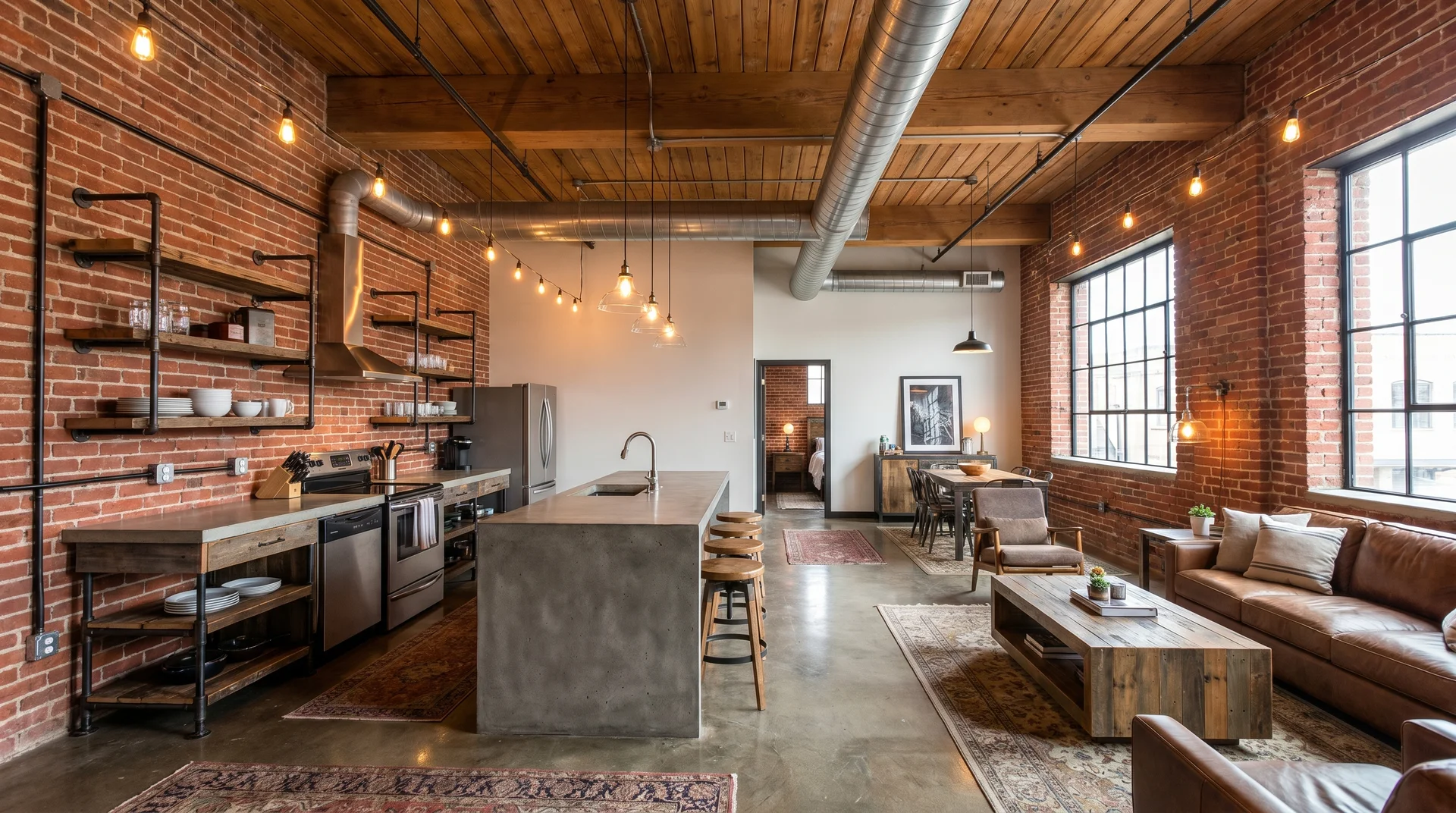
Industrial style showcases raw materials like exposed brick, concrete floors, and visible ductwork. Metal light fixtures and open shelving complete the look. This style naturally suits open layouts and makes small spaces feel intentionally minimal.
| Pros | Cons |
|---|---|
| Hides imperfections as features | Can feel cold or harsh |
| Low-maintenance materials | Hard surfaces create noise |
| Timeless, masculine appeal | May not suit all tastes |
| Easy to source materials | Concrete floors are hard on the feet |
Design Tip: Soften the industrial look with warm wood furniture and textile layers like throw pillows and blankets.
23. Scandinavian Clean-Line Layout
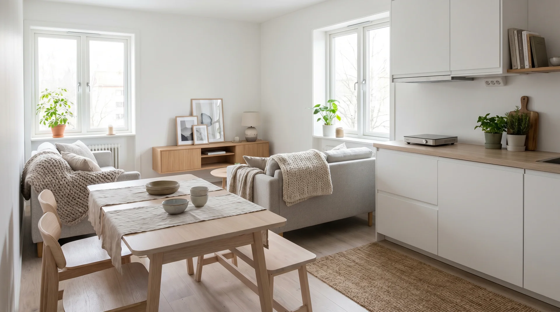
Scandinavian design uses simple lines, natural materials, and a mostly white color scheme. The focus is on function and comfort without extra decoration. This style makes small open spaces feel calm, organized, and spacious.
| Pros | Cons |
|---|---|
| Timeless, classic appeal | Can feel too minimal |
| Makes space feel larger | White shows every mark |
| Easy to maintain | May lack warmth |
| Affordable to achieve | Can look generic |
Design Tip: Add black accents and green plants to prevent the all-white look from feeling sterile or boring.
24. Rustic Modern Style With Warm Woods
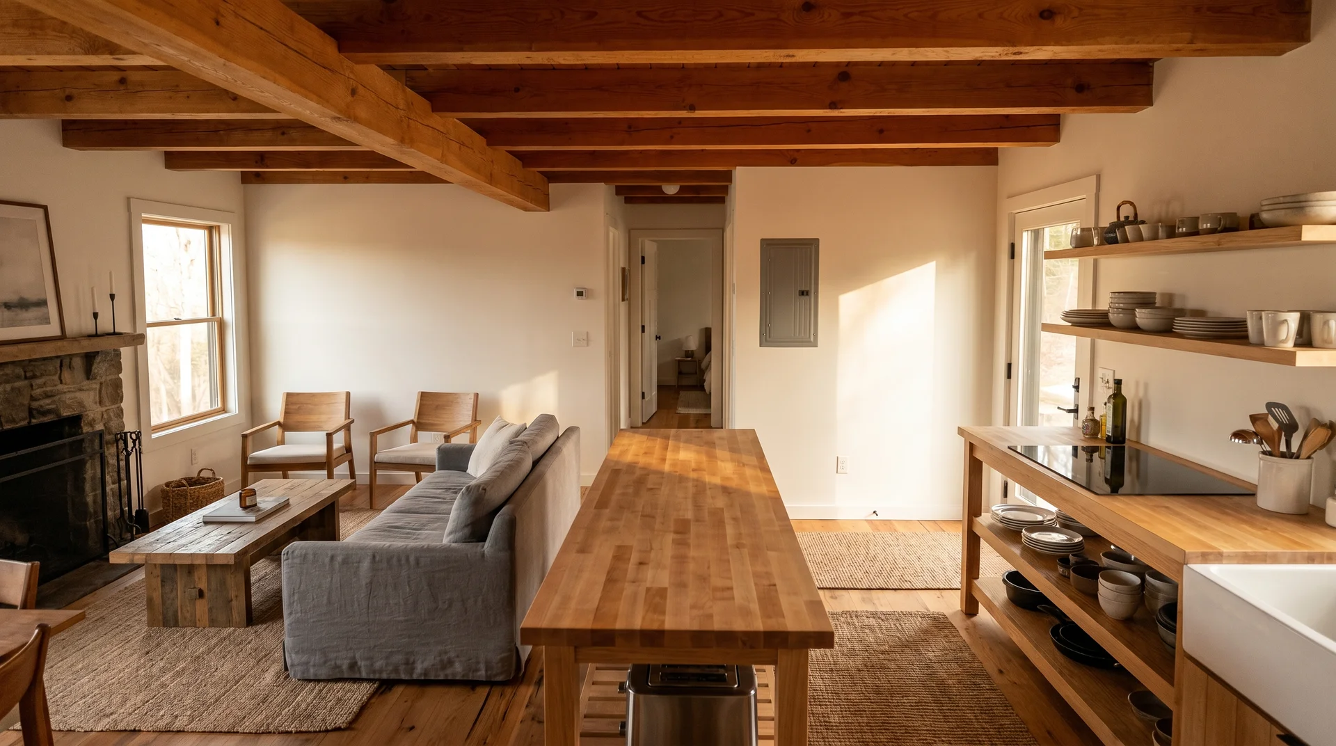
Rustic modern blends natural wood elements with clean, contemporary lines. Wood beams, plank walls, or butcher block counters add warmth. The style feels cozy and inviting while keeping a fresh, updated look.
| Pros | Cons |
|---|---|
| Warm, welcoming feel | Wood requires maintenance |
| Never goes out of style | It can look too busy if overdone |
| Adds texture naturally | More expensive materials |
| Works in any climate | Dark wood can shrink space |
Design Tip: Use light or medium wood tones rather than dark to keep your small space feeling open and bright.
25. Hidden Storage Wall for Clutter-Free Living
A hidden storage wall looks like a regular wall but opens to reveal cabinets, shelves, or closets. Floor-to-ceiling storage hides behind seamless doors that match your walls. This keeps both kitchen and living room items organized and out of sight.
| Pros | Cons |
|---|---|
| Maximizes storage without clutter | Expensive to install |
| Clean, minimal appearance | Permanent installation |
| Customizable to your needs | Takes up wall space |
| Increases home value | It can be hard to access deep areas |
Design Tip: Install push-to-open doors so you don’t need handles that interrupt the smooth wall appearance.
26. Floating Furniture Layout (No Heavy Pieces Against Walls)

A floating layout pulls furniture away from walls and into the center of the room. Your sofa sits a few feet from the wall, creating a pathway behind it. This makes the space feel larger and more intentional.
| Pros | Cons |
|---|---|
| Makes the room feel bigger | Requires more floor space |
| Better traffic flow | Can feel less cozy |
| More design flexibility | Wastes usable wall space |
| Creates zones naturally | Not ideal for very small rooms |
Design Tip: Use this layout only if you have at least 200 square feet of combined kitchen and living space.
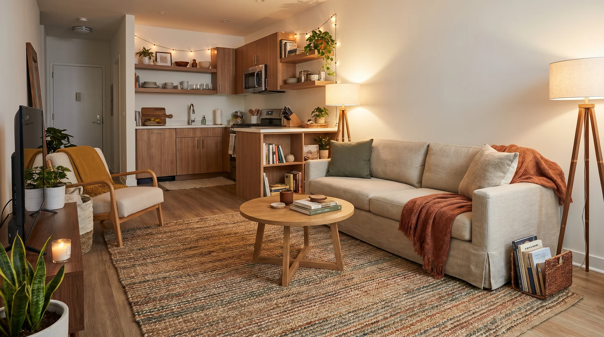
27. Accent Lighting to Create Invisible Boundaries
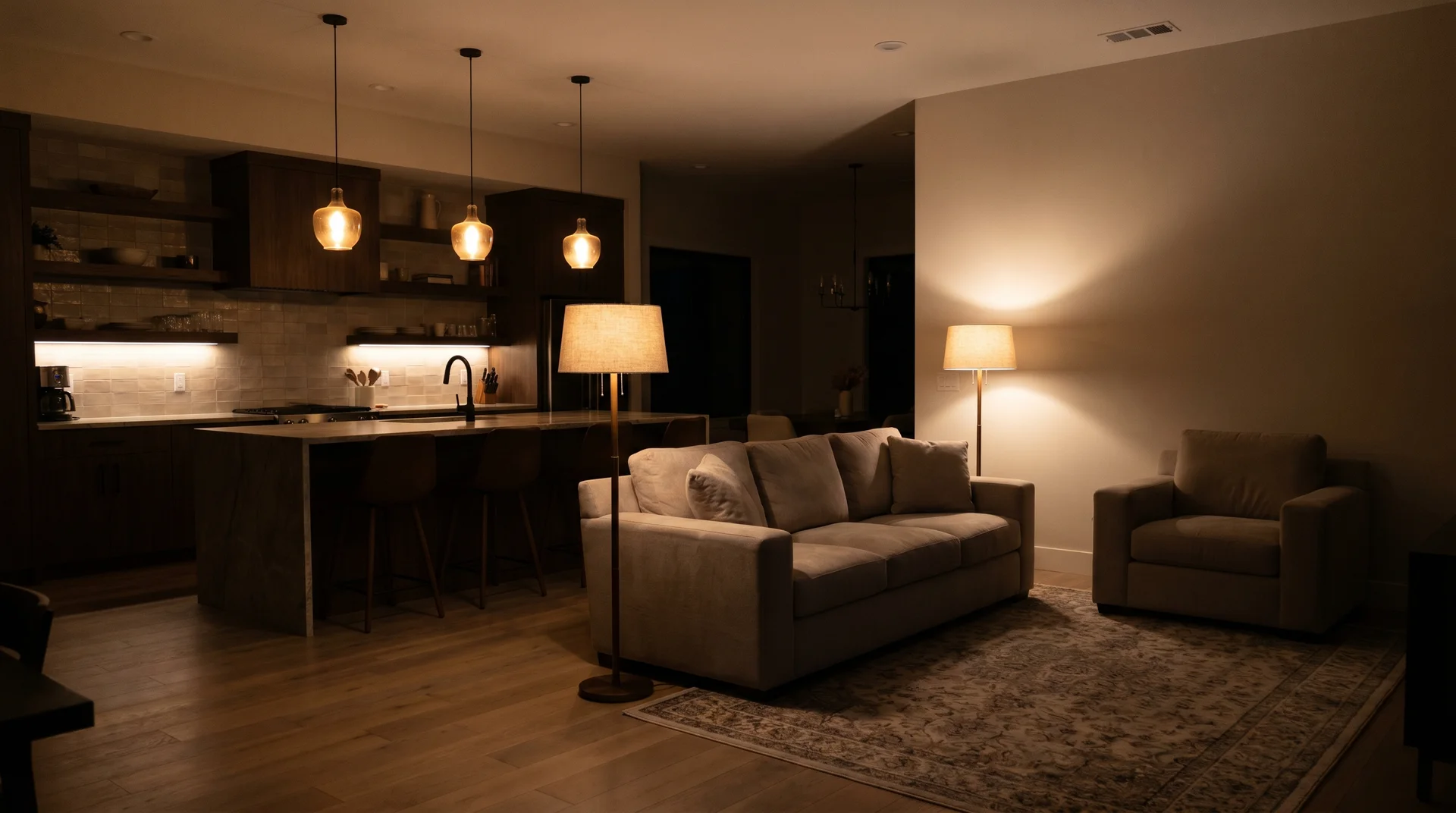
Different types of lighting mark kitchen and living areas without physical dividers. Pendant lights over the kitchen island, a floor lamp by the sofa, and under-cabinet lighting create separate zones. Each area has its own lighting mood and purpose.
| Pros | Cons |
|---|---|
| Defines spaces subtly | Multiple light fixtures cost more |
| Adjustable for different moods | Requires good planning |
| Adds ambiance and style | More switches to manage |
| Can change as needs change | Electrical work may be needed |
Design Tip: Install dimmer switches on all lights so you can adjust brightness and create different moods throughout the day.
Design Mistakes That Make Small Spaces Smaller
Even the best design ideas can fail if you make these common errors. Avoid these five mistakes that trip up most people when planning small open-concept spaces.
| Mistake | Why It’s a Problem | How to Avoid It |
|---|---|---|
| Oversized Furniture | Takes up too much floor space and blocks walkways. | Measure first. Choose smaller-scale pieces. Keep 30 inches for paths. |
| Too Many Finishes | Makes space feel busy and disconnected. | Use only 2-3 materials. Match metal finishes throughout. |
| Poor Lighting Placement | Creates dark corners and harsh shadows. | Layer overhead, task, and ambient lights in each zone. |
| Not Defining Zones | Space feels purposeless with no clear areas. | Use rugs, furniture placement, or lighting to mark zones. |
| Ignoring Storage | Clutter stays visible in open layouts. | Add vertical cabinets. Use furniture with hidden storage. |
Tips for Designing a Small Open Concept Kitchen and Living Room
Now that you’ve seen the ideas and mistakes to avoid, let’s get practical. Here are the most important tips to keep in mind when designing your small open-concept space.
- Best Materials, Colors, and Furniture Shapes: Use light-colored, reflective materials like white quartz or light wood, and choose furniture with clean lines and exposed legs to keep sightlines open.
- Smart Lighting Ideas: Install pendant lights over the kitchen, a floor lamp beside the sofa, and under-cabinet LED strips to create layers that define each zone.
- How to Avoid Clutter: Keep only daily-use items on counters, use closed cabinets instead of open shelves, and put storage baskets under tables and inside ottomans.
- What to Prioritize When Space is Tight: Focus on multi-purpose furniture, vertical storage that goes up to the ceiling, and keeping your main walkways at least 36 inches wide.
Final Thoughts
Your small house, open-concept kitchen, and living room can work beautifully with the right approach.
You now have real ideas to choose from, each with honest pros and cons. You know which mistakes to avoid and how to make every inch count.
Start with one change. Pick the idea that fits your budget and lifestyle. Maybe it’s adding a rug to define zones or swapping oversized furniture for smaller pieces.
The best open layouts don’t happen by accident. They come from smart planning and knowing what actually works in tight spaces.
Which idea will you try first? Drop a comment below and let us know your biggest challenge in your open-concept space.