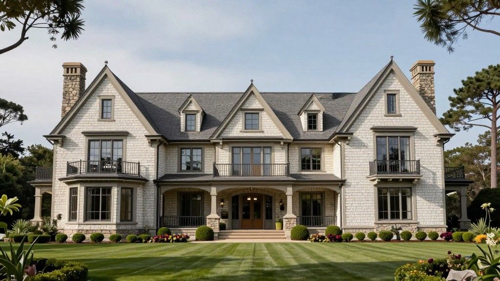
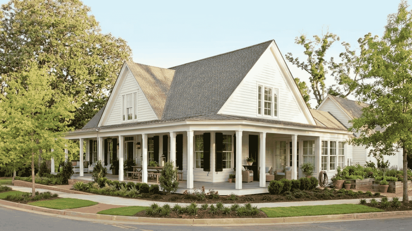
A well-painted farmhouse stops you before you reach the front door. But that look doesn’t happen by accident.
The right farmhouse exterior colors come from planning, not guessing. You need to think about your roof, landscaping, light, and climate.
This article covers color choices that work. Each comes with specific paint names, trim pairings, and climate notes. You will also find a setting-by-setting guide to help narrow things down faster.
How to Pick Farmhouse Exterior Colors for Your Setting
A farmhouse does not exist in isolation. The land, trees, and street around it are all part of the picture. The right color works with that context. Use the table below as a starting point.
| Setting | Colors That Work | Colors to Avoid | Why |
|---|---|---|---|
| Rural and Open Land | Crisp whites, dark charcoals, earthy greens, warm greiges | Very few restrictions | Open sky and fields give almost any palette room to breathe |
| Wooded | Warm taupes, muted greens, earthy browns, dusty blues | Stark cool whites, bright or saturated tones | Tree canopy dominates. Colors need to sit comfortably with dense green surroundings. |
| Suburban | Warm neutrals, muted greens, classic whites with strong trim contrast | Highly saturated or very bold colors | Street context matters. The color should feel considered, not generic. |
| Coastal | Dusty blues, blue-grays, faded indigos, soft weathered whites | Warm terracottas, deep browns, rich reds | Water and sky set a cool mineral tone. Warm earthy colors work against it. |
| Texas and High-Sun Climates | Warm greiges, earthy greens, muted whites, warm charcoals | Pale pastels, very dark blacks without UV-rated paint | Intense UV and heat speed up fading. Mid-tone and warm colors hold up best. |
Farmhouse Exterior Colors That Perform Across Climates
The colors below have proven themselves across climates, architectural styles, and roof types. Each one comes with specific paint names, a trim note, and a call-out for Texas and hot-climate homes.
1. Classic Whites and Off-Whites
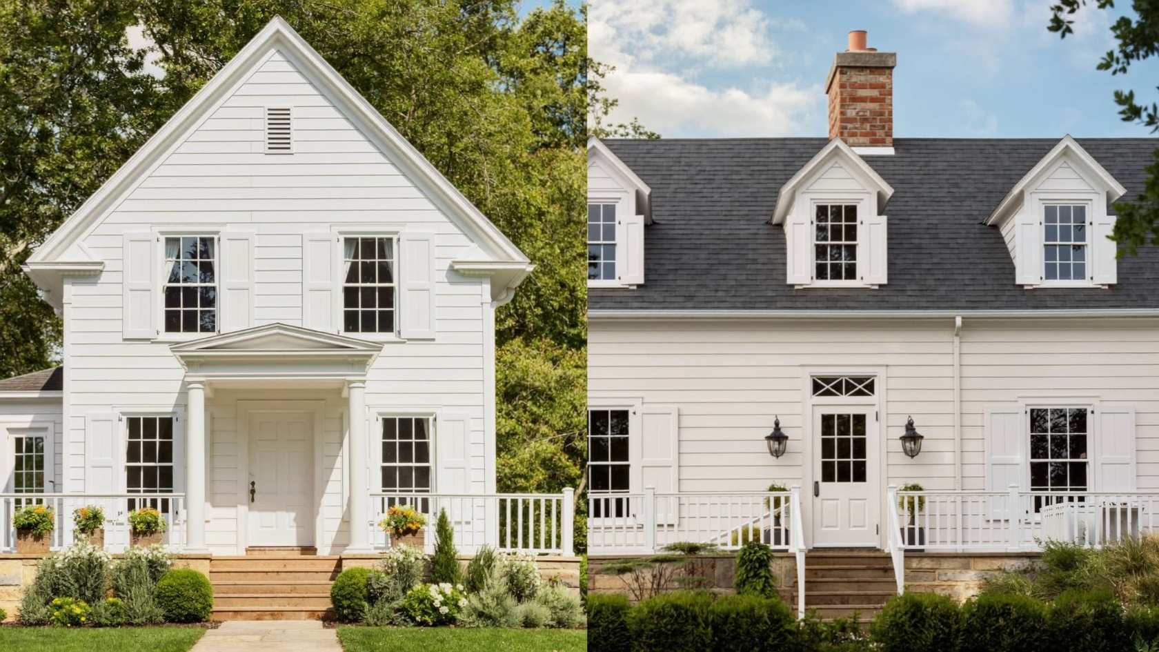
White is the default farmhouse exterior color, but not all whites perform the same way. A stark, cool white can look harsh against natural wood or stone. It also shows dirt faster in humid or dusty environments.
Look for a white with warmth underneath. Creamy, slightly yellow-toned, or softly gray-tinted whites read as clean from a distance but feel inviting up close.
- Sherwin-Williams Alabaster (SW 7008): A warm, softly creamy white. One of the most popular farmhouse picks for good reason.
- Benjamin Moore White Dove (OC-17): Slightly warmer than bright white. Pairs well with almost any trim color.
Trim pairing: Bright white or soft black for contrast. Avoid matching trim and body in the same white. It flattens the architecture.
2. Soft Neutrals and Greige
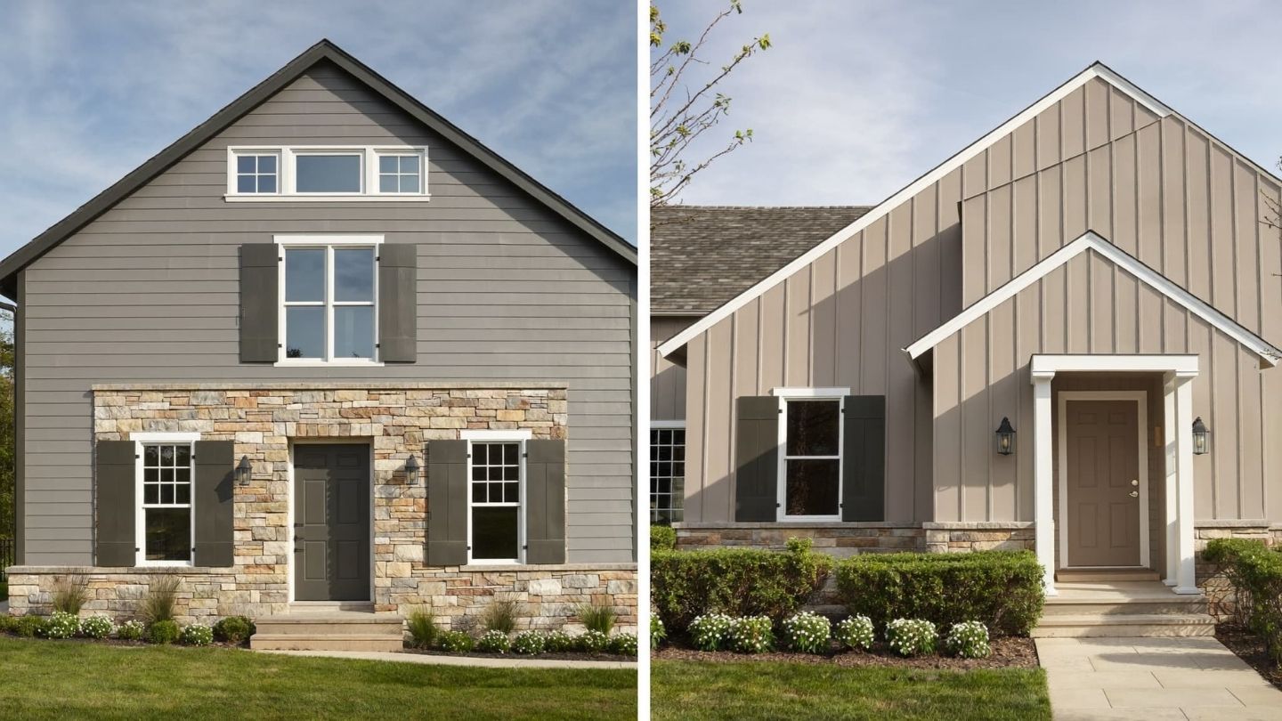
Greige sits between gray and beige. It is warm enough to feel inviting and cool enough to stay neutral in changing light. That balance makes it one of the most reliable farmhouse exterior color choices.
Greige plays well with almost every roof color, stone type, and wood tone. For homeowners who want something quieter than white but still clean-looking, greige is the answer.
- Benjamin Moore Revere Pewter (HC-172): Light gray with warm beige undertones. Consistently recommended by paint professionals.
- Sherwin-Williams Accessible Beige (SW 7036): Warm greige that reads differently throughout the day. Reliable in direct sun.
Pair with white trim and a charcoal or dark bronze roof for a sharp, finished result. The combination reads as clean from the street but has enough depth to feel considered up close.
You can see how Benjamin Moore exterior options like Revere Pewter hold up in different lighting and roof combinations.
3. Earthy Greens and Naturals
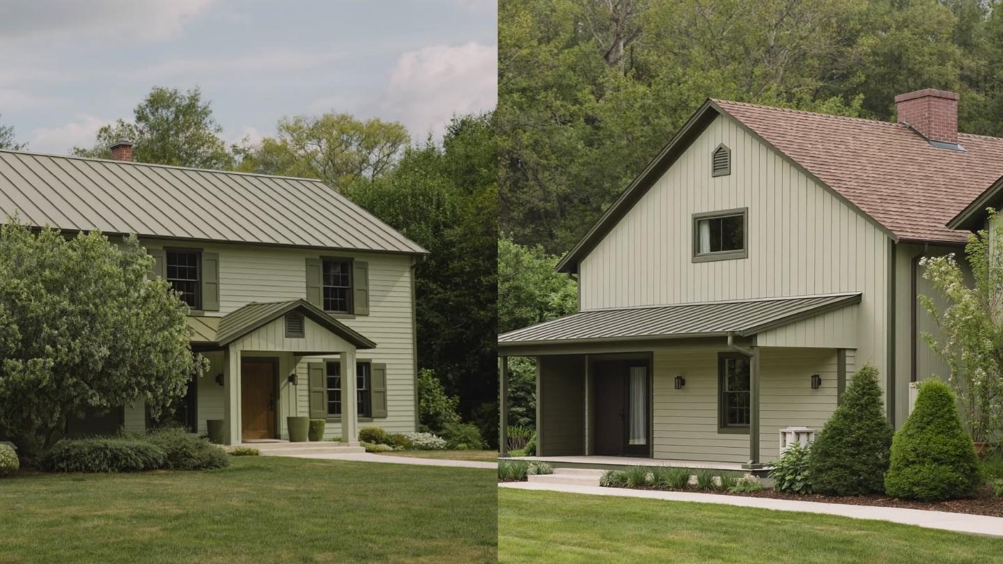
Sage, olive, and muted forest greens connect a home to its landscape. No other color family does this as naturally. These farmhouse exterior shades have real staying power because they are tied to nature, not to design cycles.
Lighter shades work well on smaller homes or lots with tree cover. Darker olive and forest tones suit larger structures with stone accents or cedar details.
- Benjamin Moore Pale Eucalyptus (2146-40): A soft, muted green that works on shadier properties.
- Sherwin-Williams Rosemary (SW 6187): A deeper sage with gray undertones. Strong and grounded on larger facades.
Trim pairing: Warm wood tones, aged copper fixtures, or black hardware. The whole exterior feels organic rather than styled.
4. Sophisticated Grays and Blue-Grays
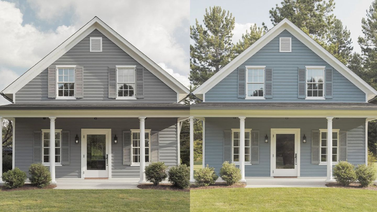
Cool grays bring a more modern edge to farmhouse exteriors. The key is avoiding grays that pull too purple or too blue in natural light. Test on the actual wall before you commit.
Slate blues sit in a cooler, more mineral space. They pair well with dark gray or charcoal rooflines. A warmer color can fight the roof rather than work with it. Slate avoids that problem.
- Sherwin-Williams Magnetic Gray (SW 7058): A balanced gray with no strong warm or cool pull.
- Sherwin-Williams Mineral Deposit (SW 7652): A cool slate blue with industrial character. Works well with metal roofing and corrugated steel details.
- Benjamin Moore Van Deusen Blue (HC-156): A deep blue-gray that reads clearly as blue but stays grounded.
Trim pairing: Crisp white. Keep everything else simple and let the gray or slate carry the look.
5. Warm Taupes and Browns
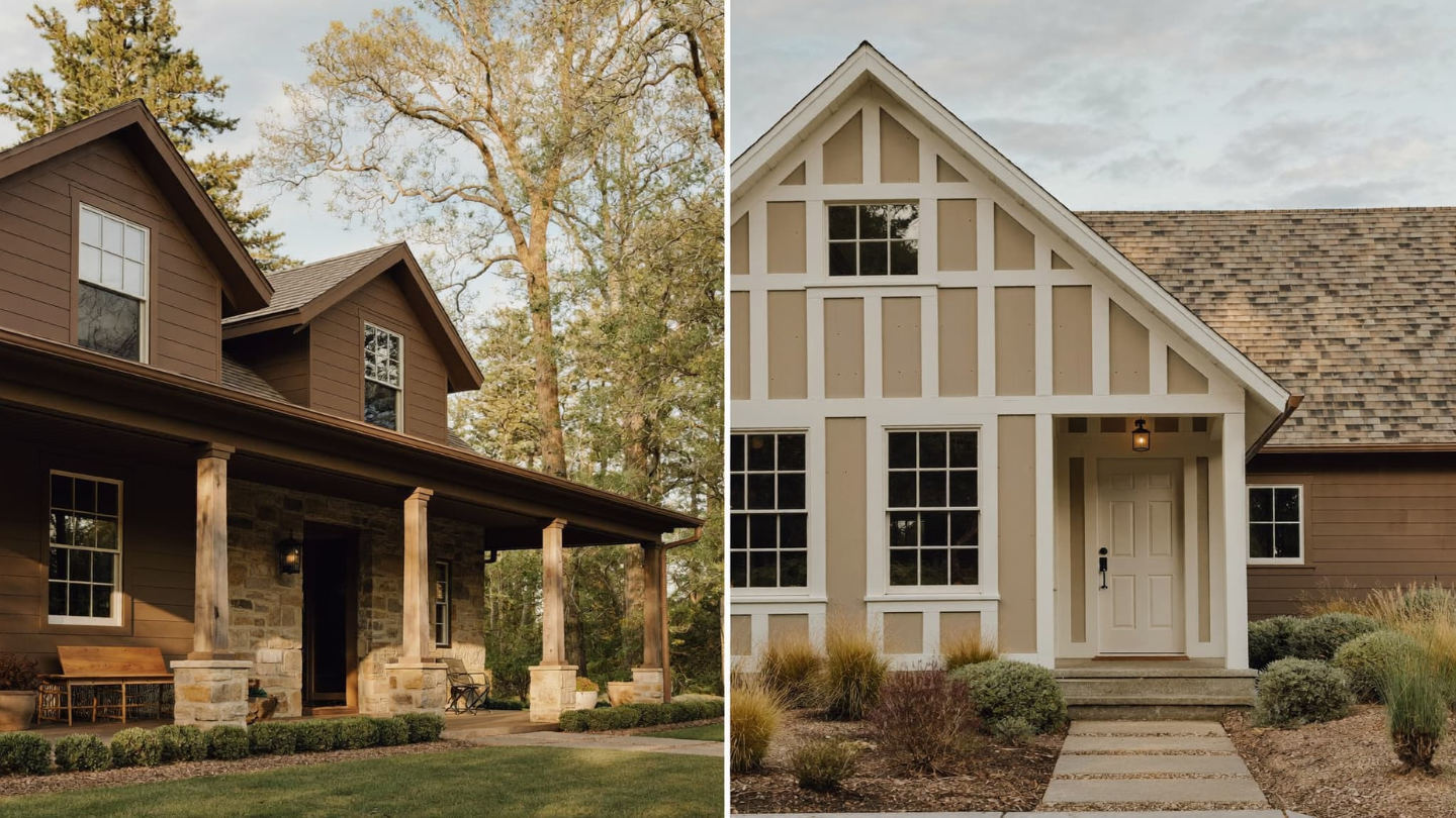
Taupe sits in the quiet space between beige and brown. It is warmer than greige and more grounded than a straight neutral. It works especially well on farmhouses with stone accents, cedar shake roofing, or exposed timber framing.
Pushed toward darker tones, taupe feels like the house grew out of the ground naturally. That quality is hard to fake with other color families.
- Benjamin Moore Carrington Beige (HC-93): A warm brown-beige with depth. Suits farmhouses with strong masonry features.
- Benjamin Moore Fairview Taupe (HC-85): Slightly warmer and richer than a standard greige.
Trim pairing: Warm white or cream. Avoid stark white. It works against the warmth of taupe rather than supporting it.
6. Soft Blacks and Deep Charcoals
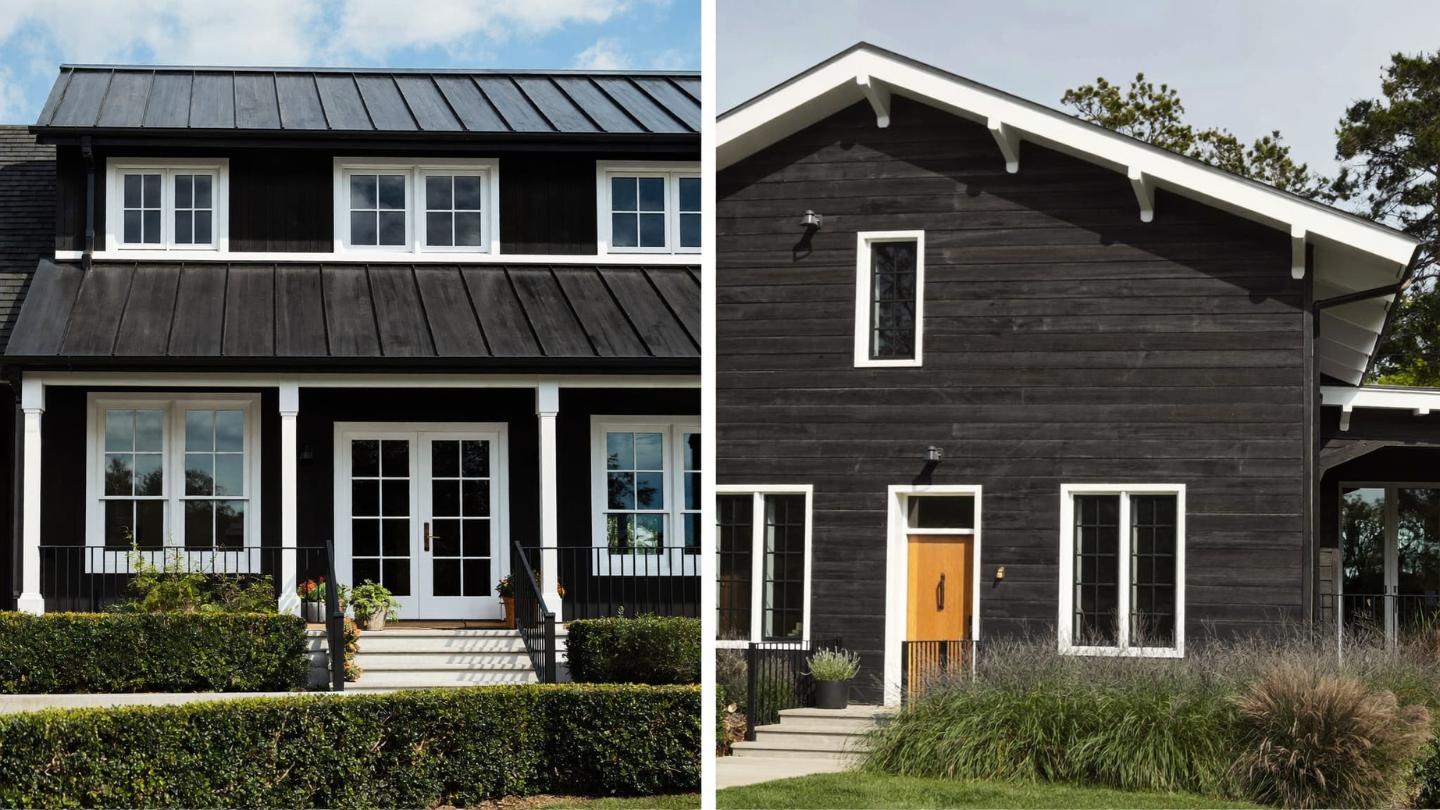
A near-black or deep charcoal on a farmhouse exterior now reads as confident and considered. This is especially true on modern farmhouse builds where contrast defines the whole look.
Not all blacks behave the same on an exterior wall. A cool blue-black can feel harsh in direct sun. A brown-black or warm charcoal stays softer. It sits more naturally alongside wood, brick, and stone.
- Sherwin-Williams Tricorn Black (SW 6258): A true neutral black. Clean and graphic with white trim.
- Sherwin-Williams Black Fox (SW 7020): A deep brown-black that photographs almost like true black but reads warmer in person.
- Benjamin Moore Wrought Iron (2124-10): A deep charcoal that is softer than pure black. Works well on larger facades.
You can see how single-story homes handle dark and white color combinations across different architectural styles.
Trim pairing: Crisp white. The contrast between dark body and white trim is the core of this look.
7. Creamy Yellows and Warm Butter Tones
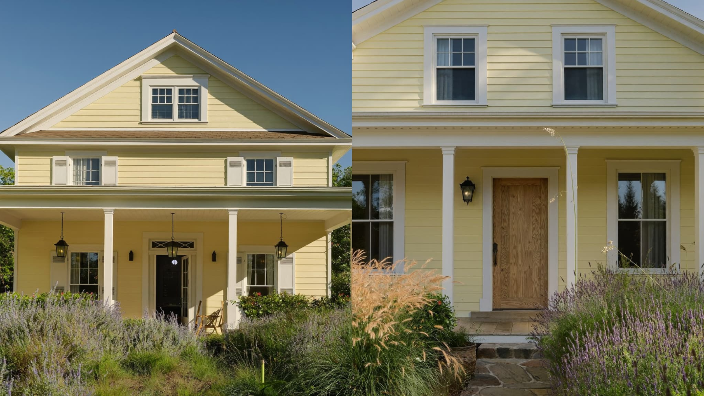
Creamy yellow on a farmhouse exterior gets overlooked because yellow feels risky. Done wrong, it is. Done right, muted and buttery and leaning toward cream, it is one of the warmest and most welcoming choices available.
The key is avoiding anything bright or saturated. You want the yellow to read almost like a warm white from a distance. Up close, the tone reveals itself in a way that feels earned, not applied.
- Benjamin Moore Hawthorne Yellow (HC-4): A grayed-down yellow that reads closer to cream than gold.
- Sherwin-Williams Harvest Gold (SW 2858): Best used as a secondary accent rather than the full body color.
Trim pairing: White, warm wood tones, or soft black. Keep hardware matte black for a clean finish.
8. Dusty Blues and Faded Indigos
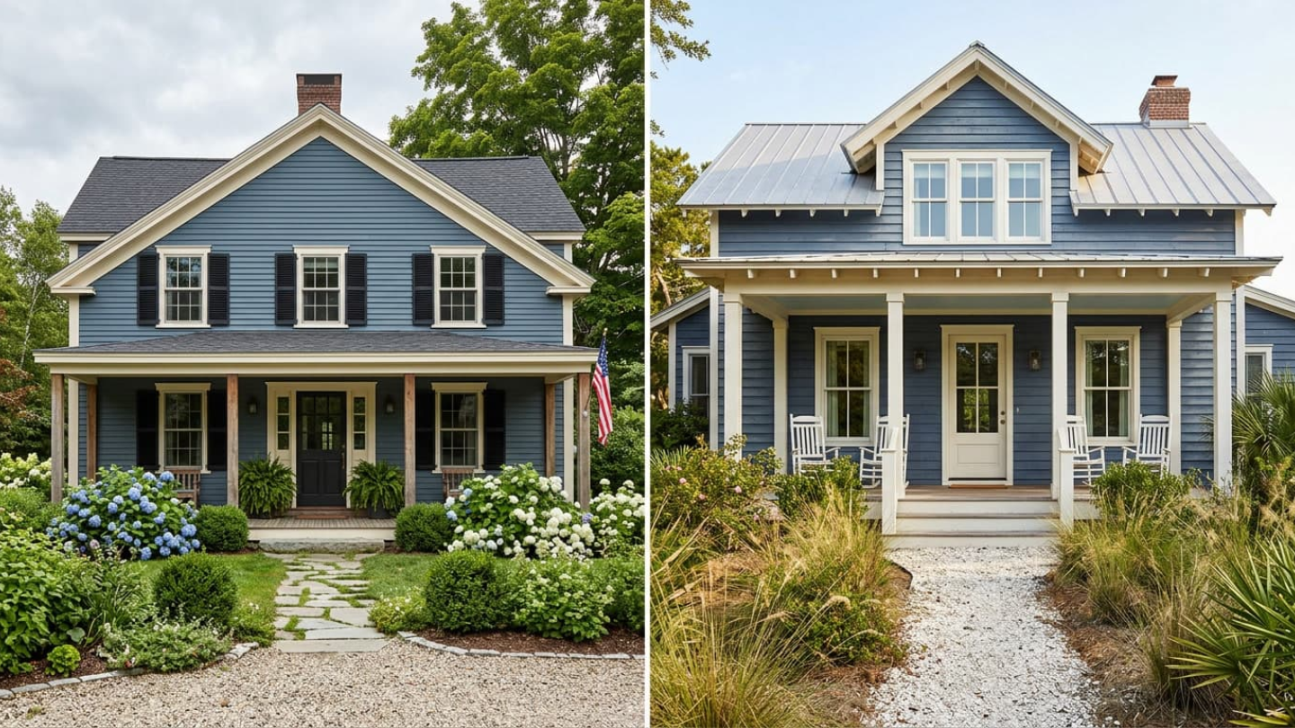
Muted, slightly weathered blues have a long history in rural American architecture. Think old New England clapboard houses and southern coastal cottages. That heritage carries into modern farmhouse design when the tone is right.
True indigo or saturated navy is too strong for most farmhouse bodies. Look for a version that has been faded back. It should be blue enough to register clearly, but muted enough to feel like it belongs outdoors.
- Sherwin-Williams Smoky Blue (SW 7604): A soft, dusty blue-gray with easy outdoor character.
- Benjamin Moore Newburyport Blue (HC-155): A classic New England blue that suits traditional farmhouse proportions.
Trim pairing: White or warm off-white. Black hardware and shutters sharpen the look without overpowering it.
9. Soft Terracotta and Clay Tones
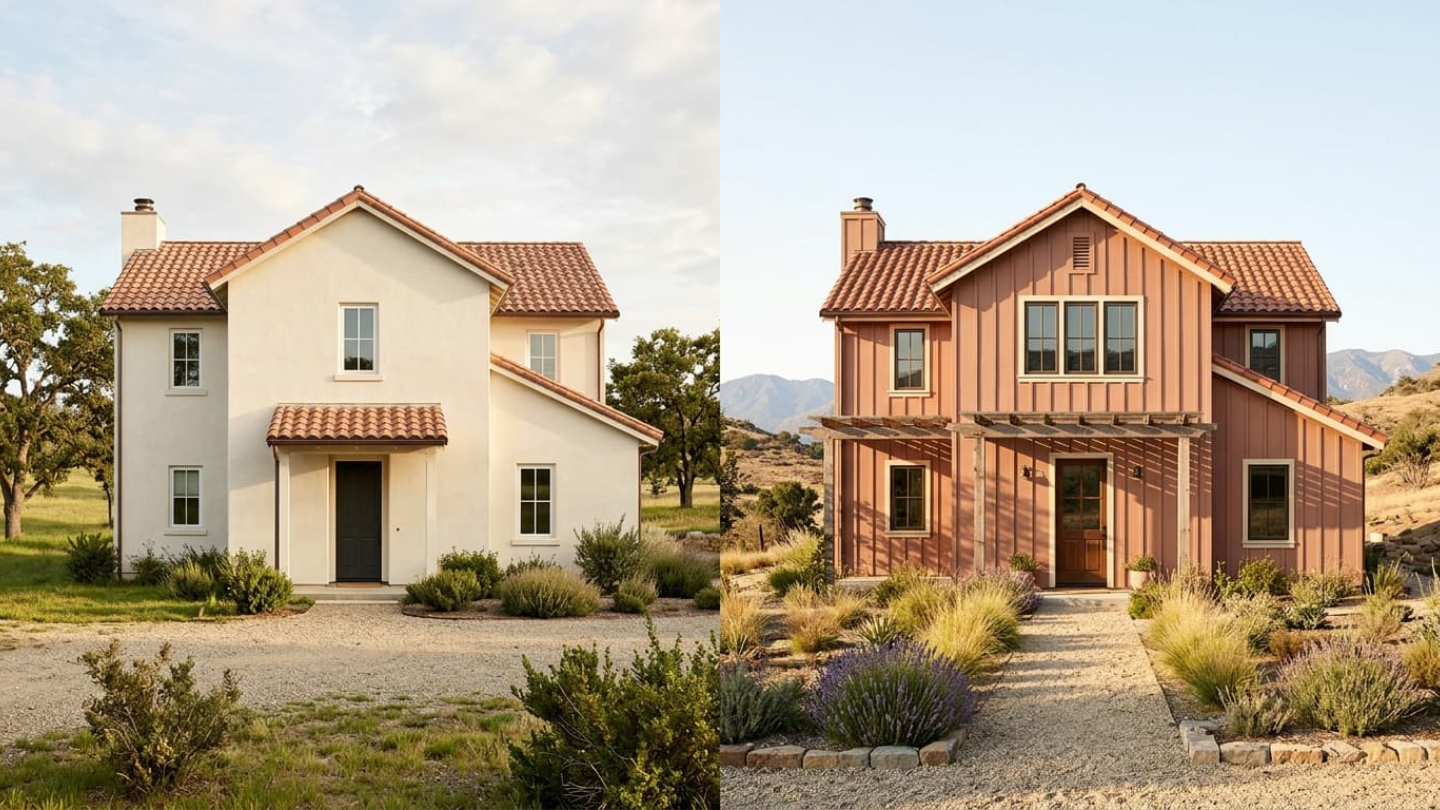
Terracotta on a full exterior is a commitment. When it works, it really works. The key is choosing a version that has been muted and dusted back. Avoid anything that reads orange.
Think sun-baked clay rather than a terracotta pot fresh from the garden center. The muted version reads as earthy and warm without drawing too much attention.
- Benjamin Moore Rust (2175-30): A deep, muted clay that stays rich without turning orange.
- Benjamin Moore Adobe Dust (2175-40): A lighter clay tone. Works well on smaller facades or as a complement to white trim.
Choosing the right exterior paint brand matters for clay and terracotta tones. Pigments in this range need strong UV resistance to hold their warmth over time.
Trim pairing: Warm white or cream. Wood tones in the same warm family also work well.
10. Muted Lavenders and Dusty Mauves
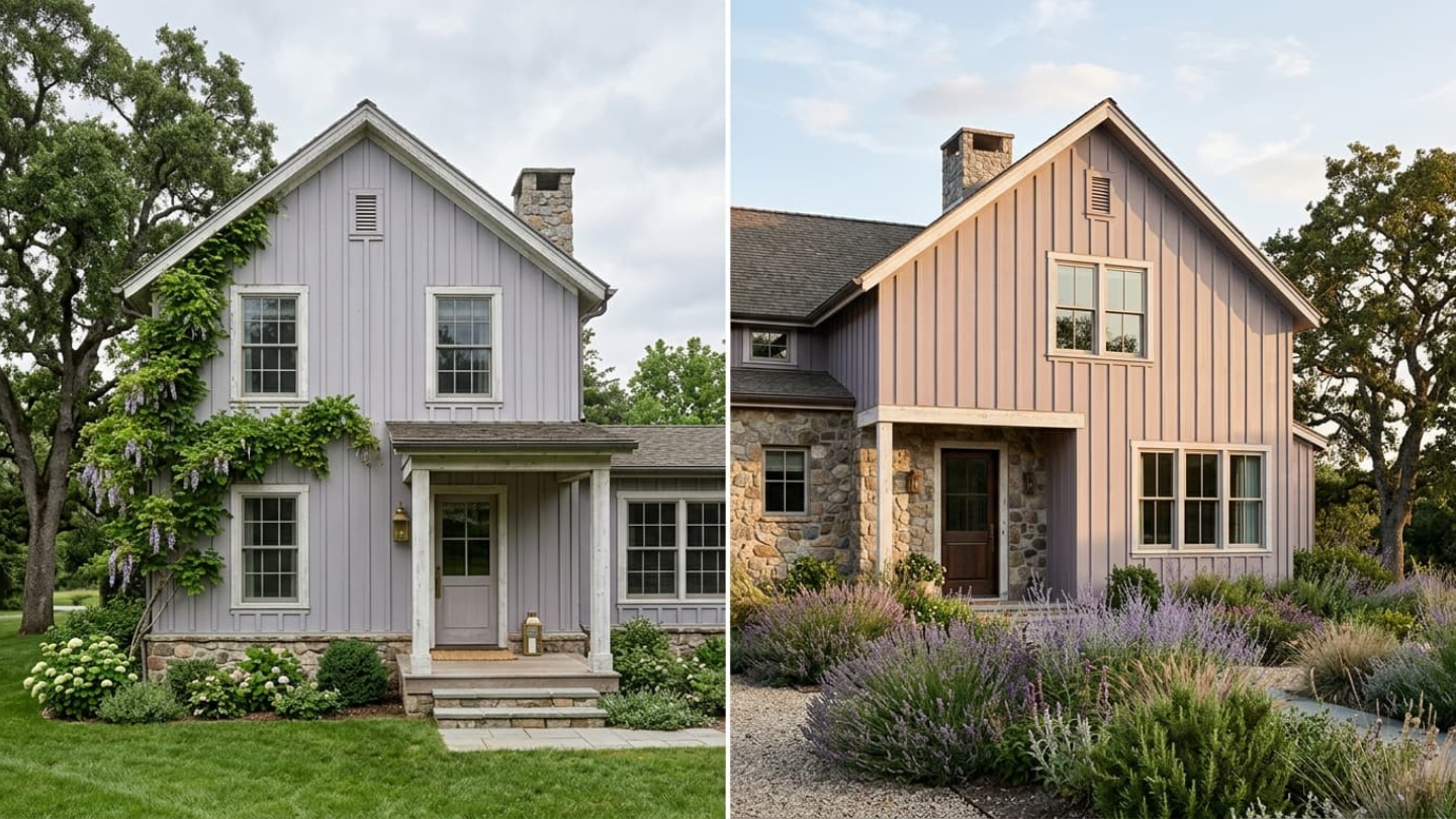
This is the most underused color family in farmhouse exterior design. A heavily grayed-down lavender stops being a “purple house.” It becomes something unexpected and quietly striking against natural surroundings.
These colors read differently depending on light conditions. On overcast days, they appear nearly neutral. In late-afternoon sun, they take on a gentle warmth that is hard to find in other color families.
- Benjamin Moore Violet Mist (1437): A grayed-down lavender with a soft mauve undertone.
- Benjamin Moore African Violet (2116-50): Pushed toward gray. Sophisticated and unusual without being loud.
Where it works: Older farmhouse structures with natural wood porches, climbing vines, or mature landscaping. The softness of these farmhouse exterior colors feels earned in an established setting.
Trim pairing: Warm white. Avoid cool white. It works against the warmth in the mauve undertones.
11. Warm Blacks with Brown Undertones
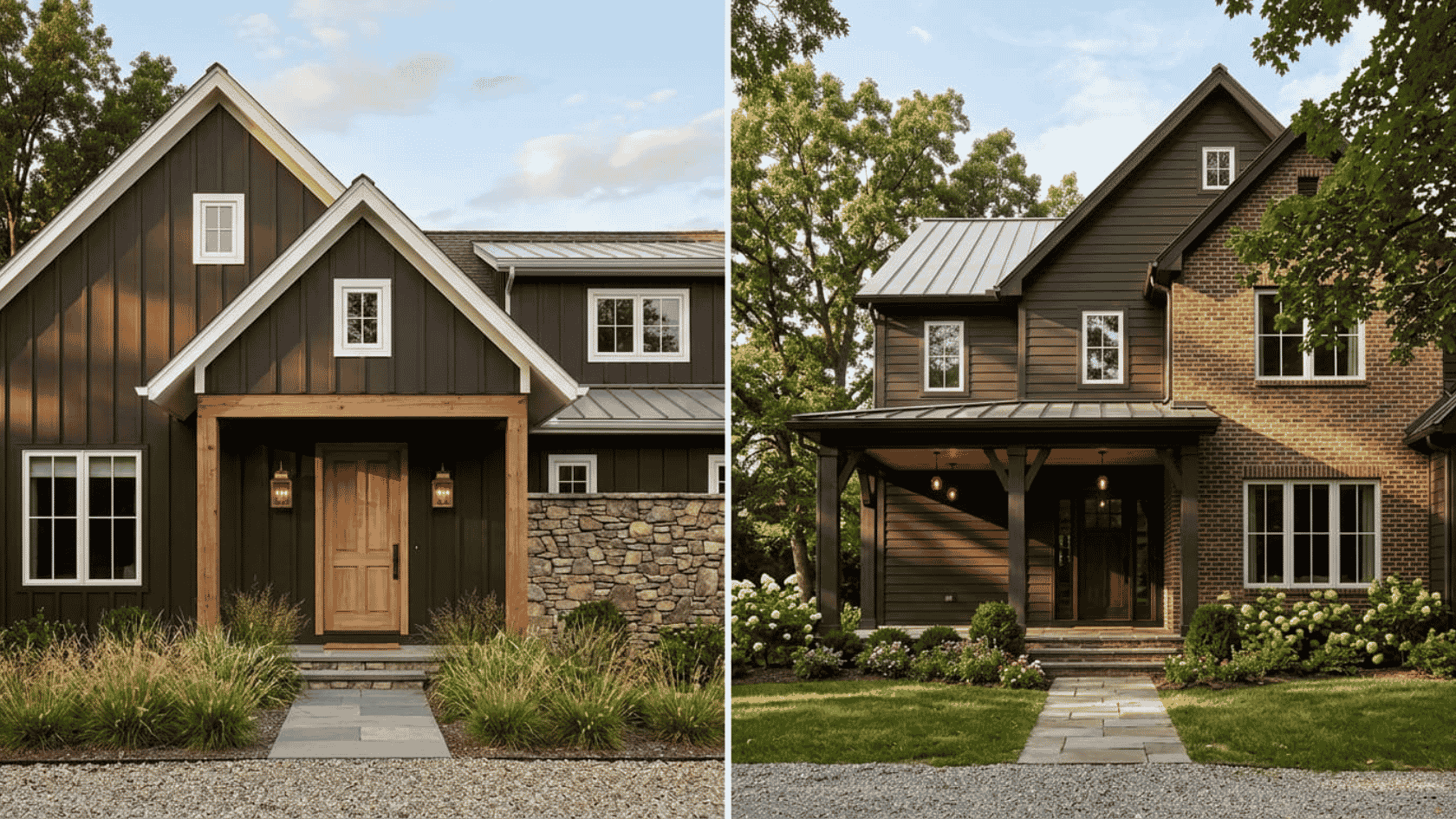
Not all blacks read the same on a farmhouse exterior. Brown-based blacks feel warmer and softer than cool blue-blacks.
They work naturally with wood, brick, and stone, creating a darker exterior without feeling too harsh.
- Sherwin-Williams Black Fox (SW 7020): A deep brown-black that looks nearly black but reveals warmth in natural light.
- Benjamin Moore Dark Walnut (1358): A rich blackened brown that pairs well with earthy materials.
These shades are ideal for traditional farmhouses where natural textures already bring warmth into the design.
Trim pairing: Warm white, cream, or natural wood tones.
12. Soft Pinks and Dusty Roses
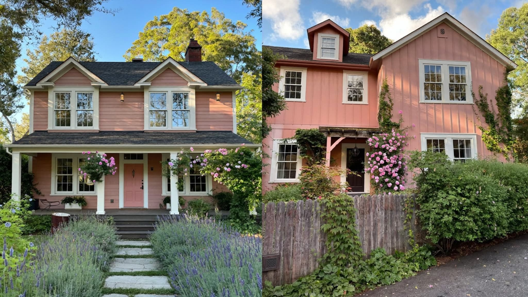
A dusty rose farmhouse exterior feels unexpected, but muted versions can work beautifully in the right setting.
Avoid bright pinks. The best options are softened with gray or beige so they read more like warm neutrals.
- Sherwin-Williams Carley’s Rose (SW 9002): A faded rose with a soft, traditional feel.
- Sherwin-Williams Rambling Rose (SW 6305): A muted pink that works well with wood and landscaping.
These colors suit older farmhouses, cottage-style homes, and properties with mature gardens where the softness feels natural.
Trim pairing: Warm white, cream, or wood tones.
13. Slate Blues and Steel Tones
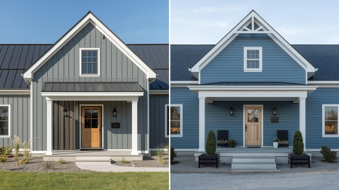
Slate blue sits between dusty blue and deep blue-gray. It feels cooler, more mineral, and works especially well with modern farmhouse materials.
It pairs naturally with charcoal roofs, black windows, and metal accents where warmer colors may compete.
- Sherwin-Williams Mineral Deposit (SW 9026): A cool slate blue with a subtle industrial feel.
- Benjamin Moore Van Deusen Blue (HC-156): A deep blue-gray that adds depth without feeling too bold.
- Steel Blue: A muted blue-gray option with a clean exterior look.
These shades work best when the rest of the exterior stays simple and lets the color stand out.
Trim pairing: Crisp white or soft gray-white.
Farmhouse Exterior Color Mistakes to Avoid
These farmhouse exterior color mistakes are common across all home styles. Each one leads to a result that looks off, dates quickly, or costs more to fix later.
Picking a Stark White Without Testing It
Cool whites look sharp on a chip and clinical on a full exterior. They can look harsh against natural wood, stone, and most roof colors.
Always test a warm white alternative like Alabaster or White Dove next to your first choice. Look at both in morning light, noon light, and late-afternoon light before you decide.
Using Too Many Accent Colors
Two competing accents create visual noise. A navy door with barn-red shutters, for example, makes the whole exterior feel unsettled.
Pick one place to make a statement. Keep everything else quiet. Hardware and light fixtures count too. They add up faster than you might expect.
Ignoring Maintenance Needs
Dark colors fade faster on sun-exposed walls. Bright whites show dirt and mildew more visibly than any other shade.
Mid-tone greiges, taupes, and muted greens are the most forgiving over time. This is especially true in humid or high-sun climates like Texas. Heat and UV exposure shorten a paint job’s lifespan faster there than in cooler regions.
Choosing Color Based on Indoor Chip Samples Alone
Paint chips look different indoors under artificial light than they do on a full wall in natural light. Apply a large swatch, at least 12 by 12 inches, directly to your wall. Live with it for a few days before committing.
Frequently Asked Questions
What is the most popular farmhouse exterior color?
Warm white is the most popular farmhouse exterior color. Sherwin-Williams Alabaster and Benjamin Moore White Dove work well with wood, stone, and different roof styles.
Do dark farmhouse exterior colors work in Texas?
Yes, but they need UV-resistant paint and proper maintenance. Dark colors absorb more heat and may fade faster in strong Texas sunlight.
What trim color goes with a farmhouse exterior?
White, off-white, and warm cream trims work well. Bright white suits dark exteriors, while warmer trims pair better with greige, taupe, and cream shades.
How do I choose between greige and white for a farmhouse exterior?
White creates a brighter, classic look, while greige feels softer and hides weather changes better. Greige often pairs well with warm roofs and stone accents.
Can a modern farmhouse exterior have color instead of white?
Yes. Deep greens, charcoals, muted blues, and warm taupes work well when paired with simple trim, hardware, and roof choices.
What color should a farmhouse front door be?
Black, navy, forest green, and charcoal are popular farmhouse door colors. They add contrast while keeping the exterior balanced.
Final Thoughts on Farmhouse Exterior Colors
Choosing the right farmhouse exterior colors takes more thought than pulling a favorite shade off a chip rack. Start with your setting, your roof, and your climate.
Work with fixed elements before adding new ones. Pick colors that feel current without chasing trends. Treat your door, shutters, and trim as separate decisions, not afterthoughts.
Get those pieces right, and your home will look like it was always meant to be exactly that shade.